Personal
Branding
_
Social Media & Branding
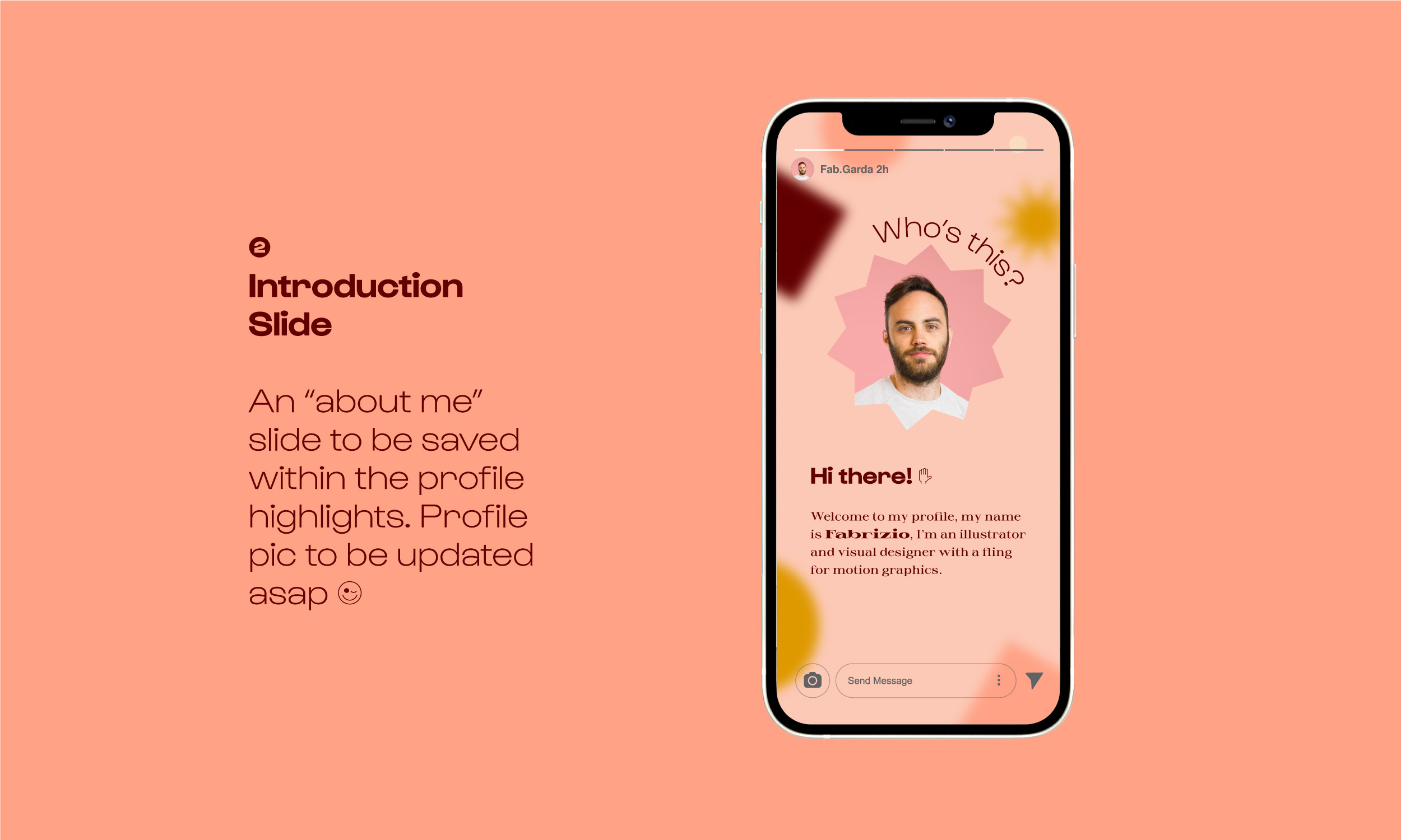
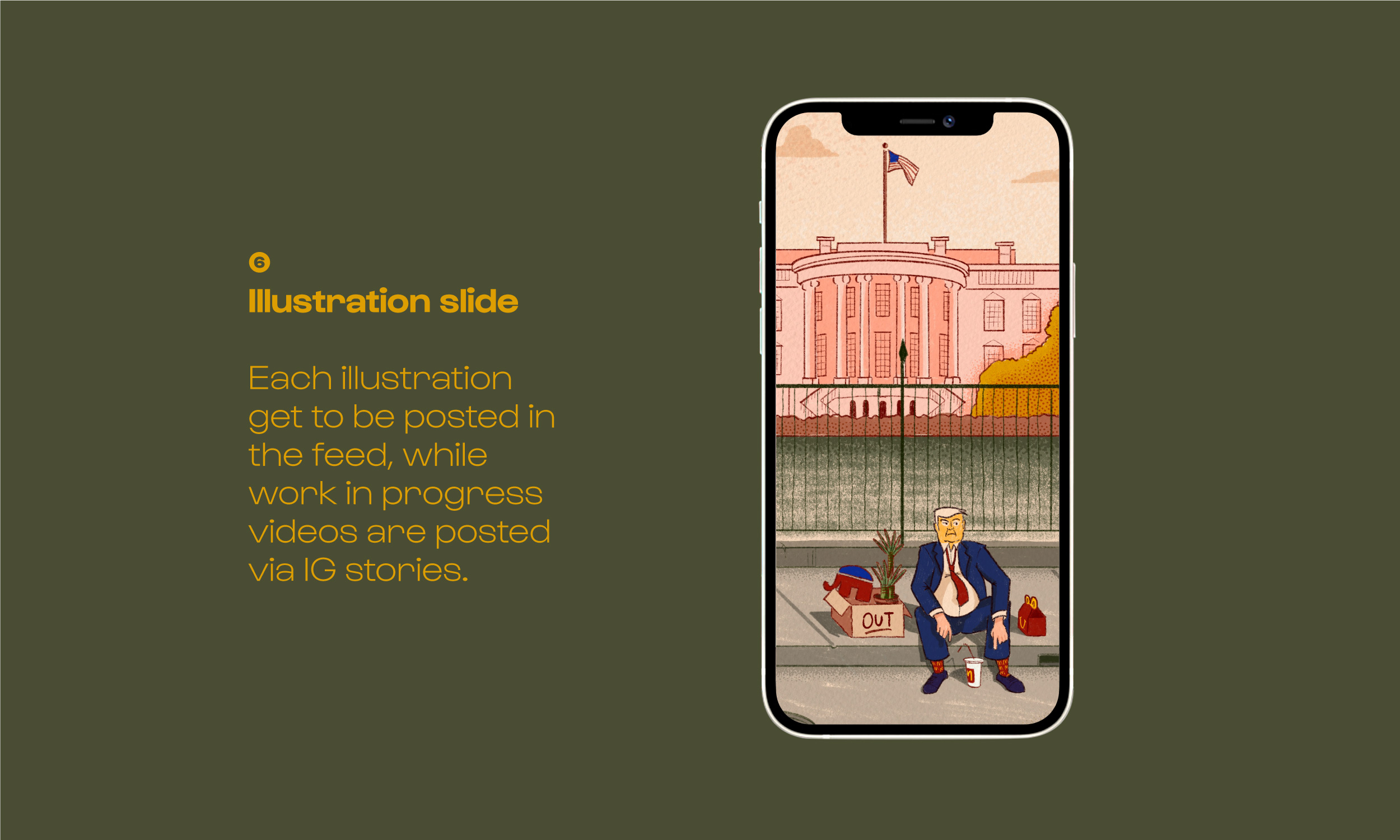
In my free time I pursue an interest for illustration, that when time is right, allows me to feed an instagram account with a fair amount of illustrations on a weekly basis. With this project my intention has been to provide a more consistent experience to those people that decided to follow me, with different content options, that could provide more entertainement, with a unique and overarching message, related to “my brand”.
If I had to describe my “brand”; I’d say it is quirky, and funny, sometimes with either daddy-humor or dark-humor and a little bit of self introspection; or at least those are the feelings that I wish my followers could experience while watching at my works.
Credits:
Gustavo Font Family .................................... Lift Type®
Sprat Font Family ......................................... Colllettivo Design Collective
Collaterals Mockup ...................................... MockupWorld
If I had to describe my “brand”; I’d say it is quirky, and funny, sometimes with either daddy-humor or dark-humor and a little bit of self introspection; or at least those are the feelings that I wish my followers could experience while watching at my works.
Credits:
IPhone12 Mockup ......................................... Apple®
Gustavo Font Family .................................... Lift Type®
Sprat Font Family ......................................... Colllettivo Design Collective
Collaterals Mockup ...................................... MockupWorld
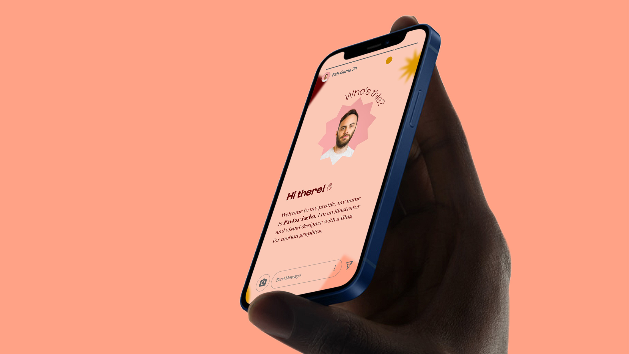
A flexible design system
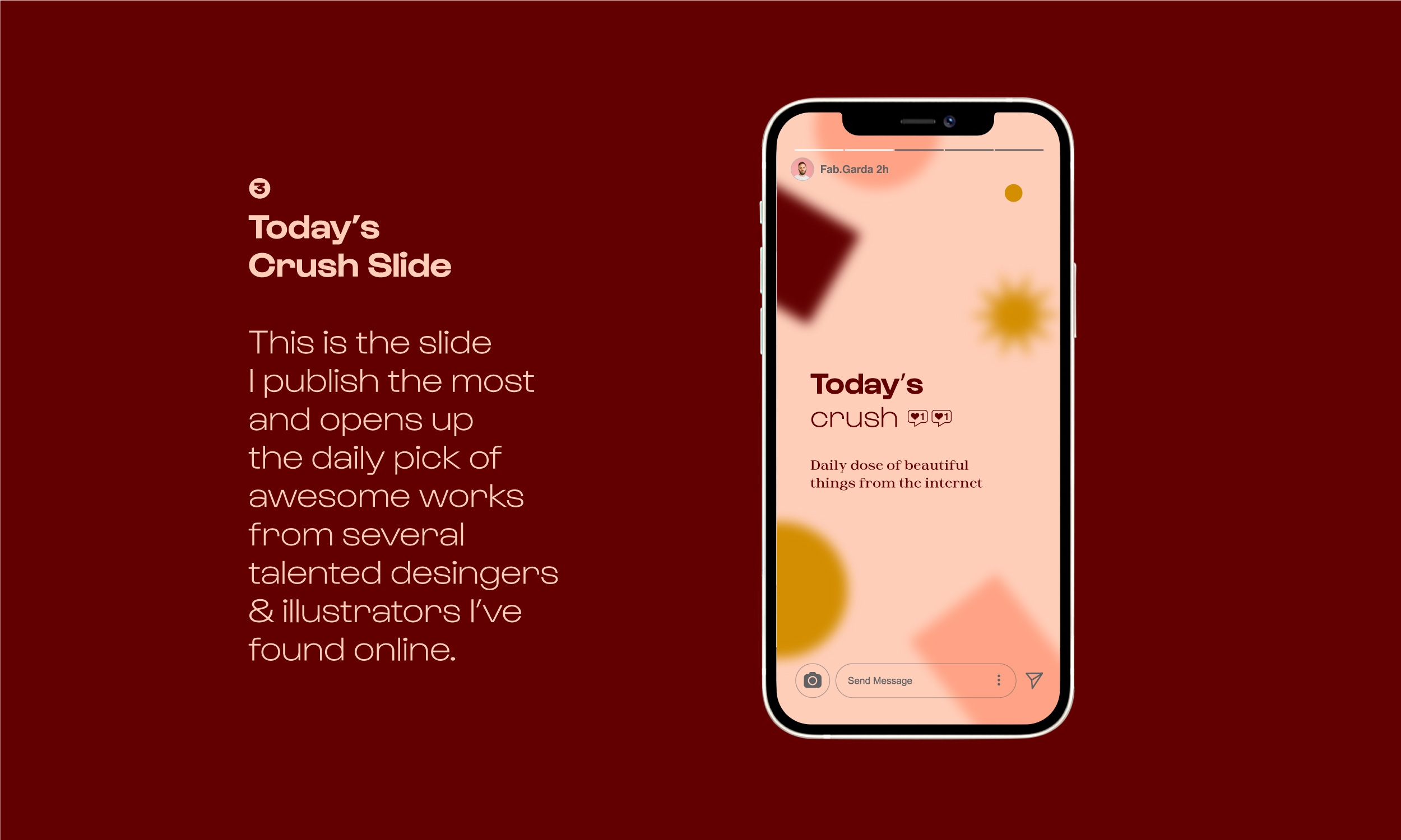
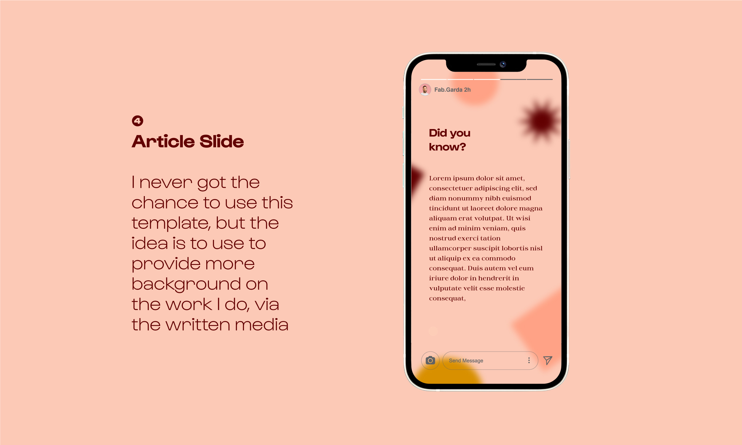
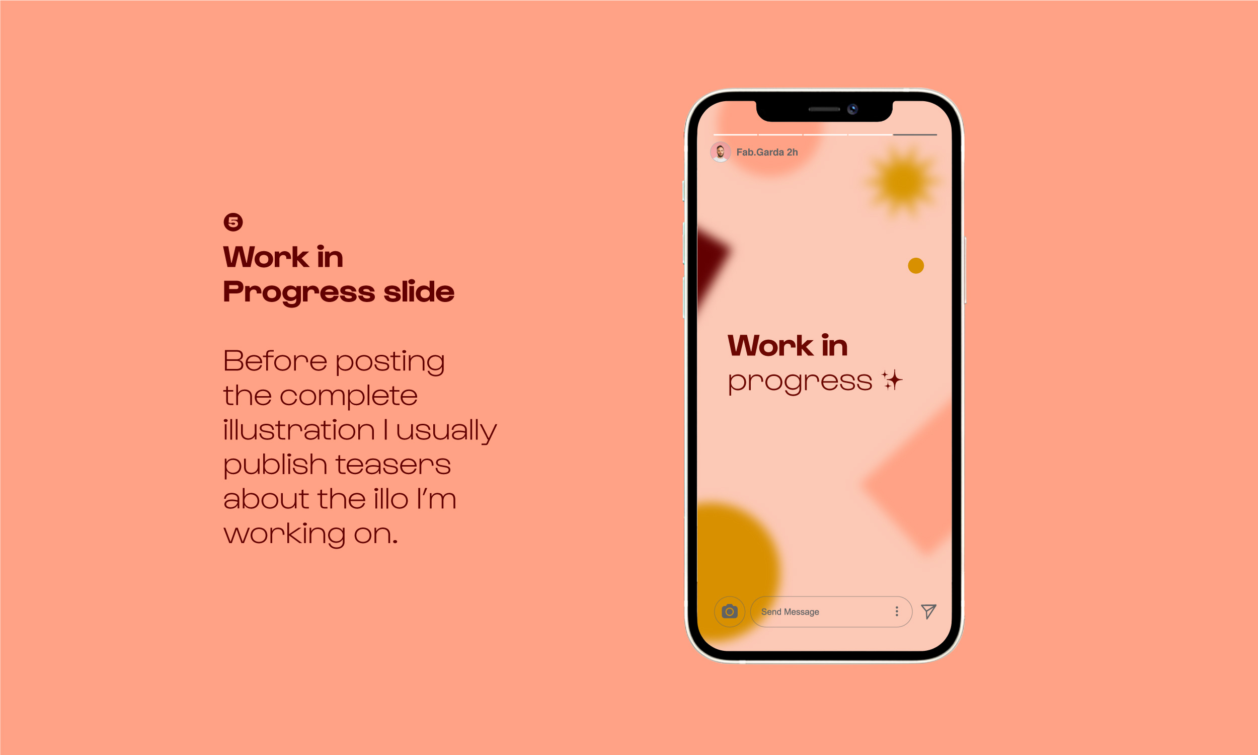
As every post requires collateral materials, I had to create a system that allowed me to have graphics for every illustrations I make, consistent with the palette of each illustration. These collateral graphics usually comprehends:
︎︎︎ Work in progress videos
︎︎︎ Daily picks from the instagram feed
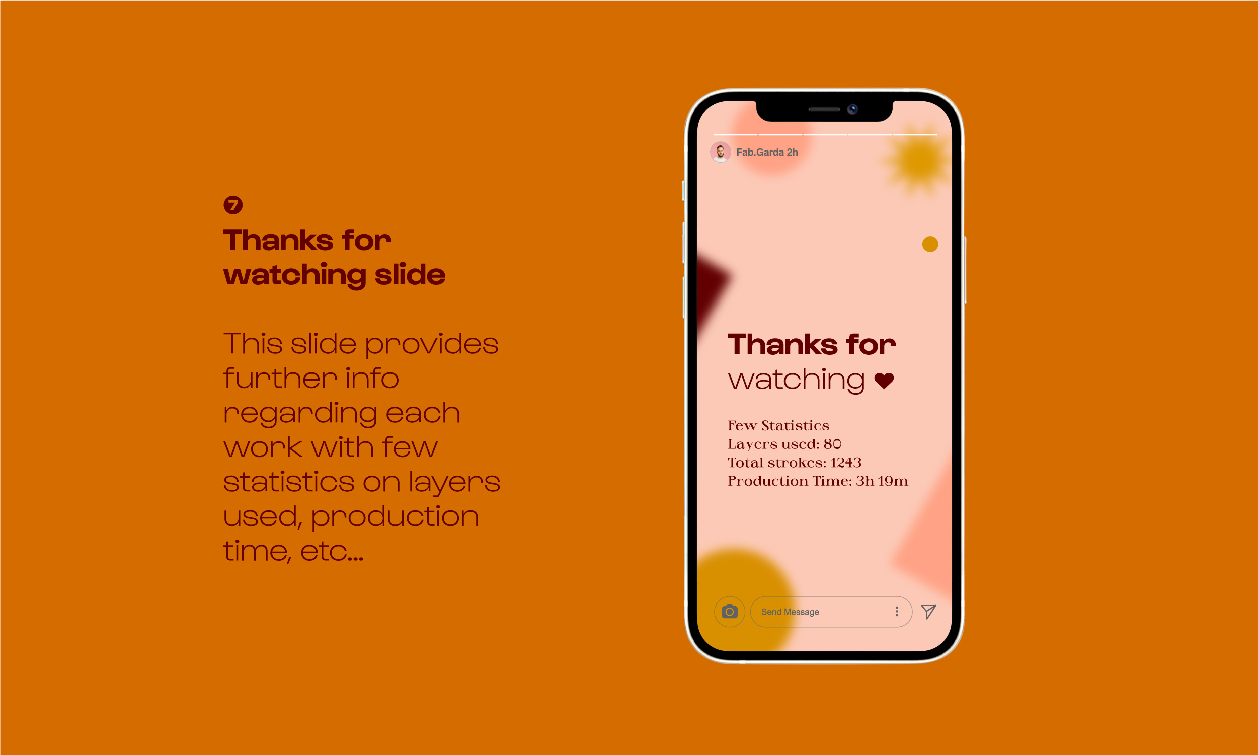
︎︎︎ Projects statistics
︎︎︎ Article Slides
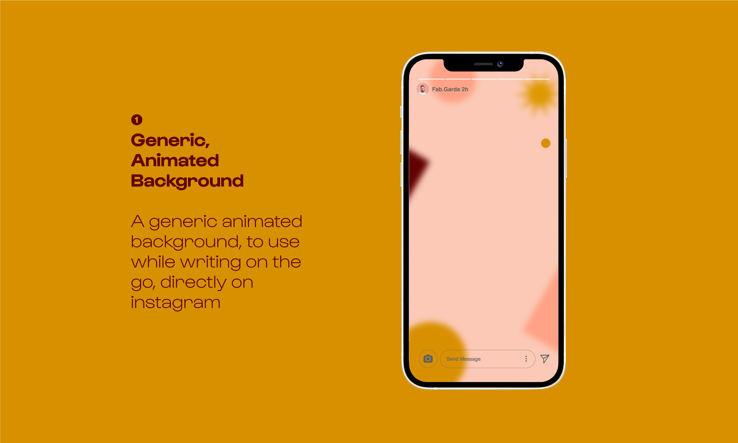
︎︎︎ Animated Backgrounds
Few recurring visual elements, squares, bursts, circles and more, change color according to the illustration the graphic is going to introduce; in doing so, every illustration get promoted with its own set of elements that emphasize its palette and provide curiosities about each piece.
![]()
Fonts Usage

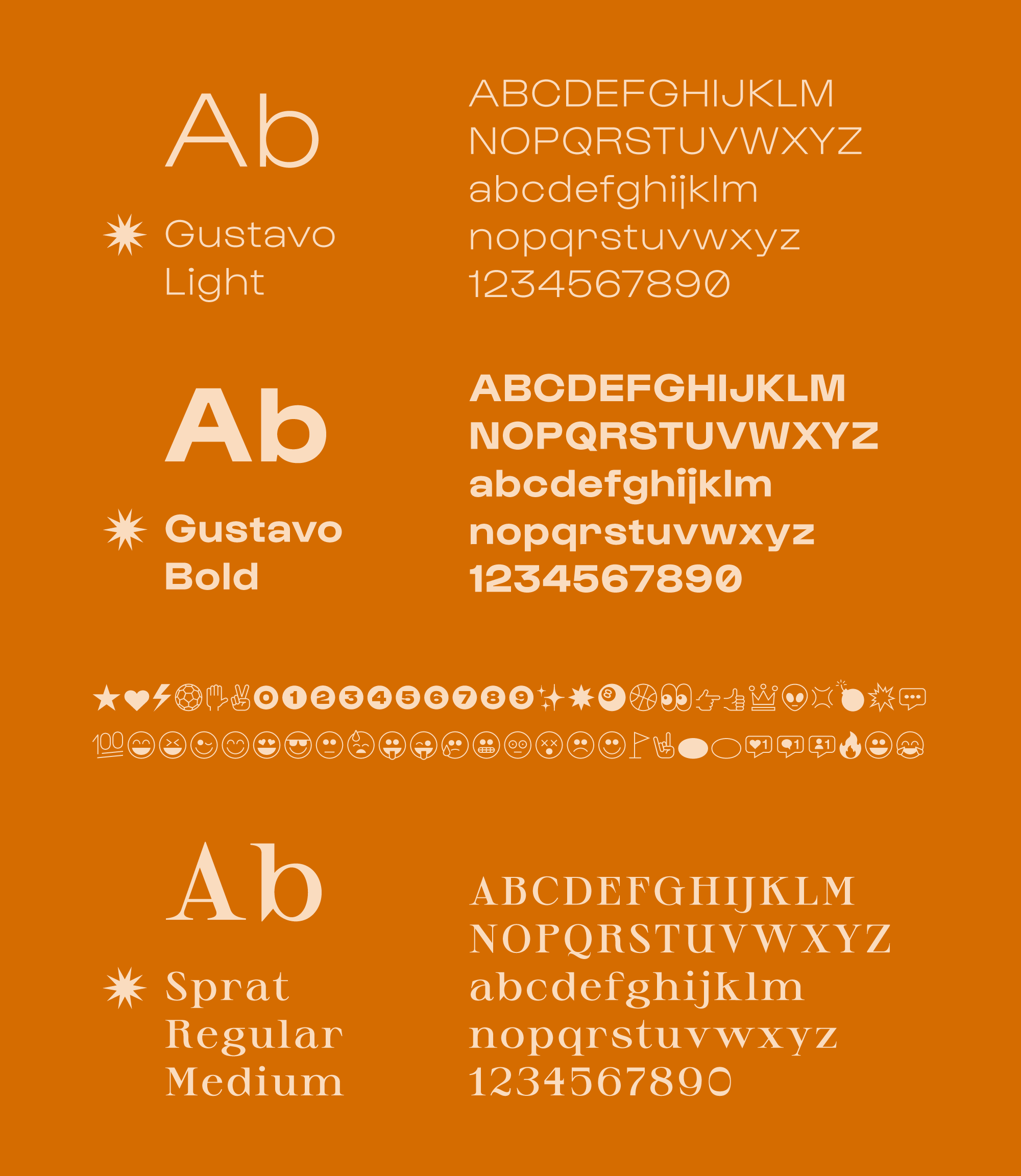
The selection of the font family has been crucial, and I selected two fonts with very different vybes.
︎︎︎ Gustavo Family
Non serif family, here used in two weights serves as primary font, applied to titles and claims. This font family comes with a huge selection of glyphs and icons that play a major role into the overall layout design.︎︎︎ Sprat Family
Serif variable font family, here is used in one weight for bodycopy, paragraphs and descriptive texts in general.︎ Credits:
Check at the beginning of this project page for full credits.

![]()
Collaterals

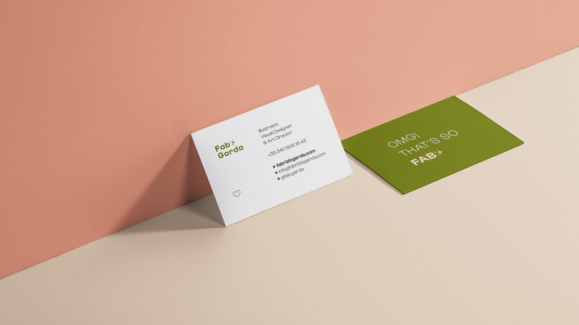
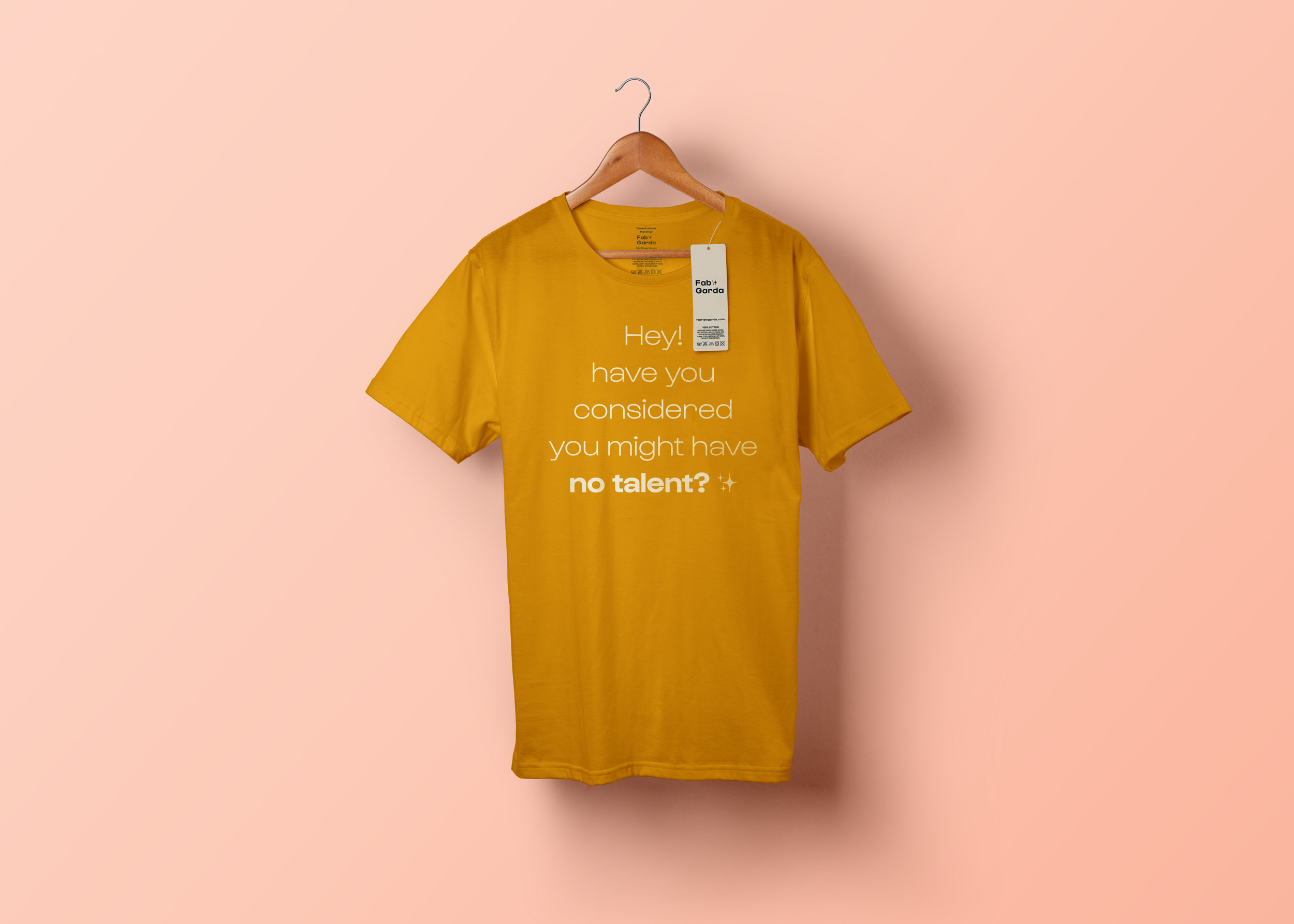
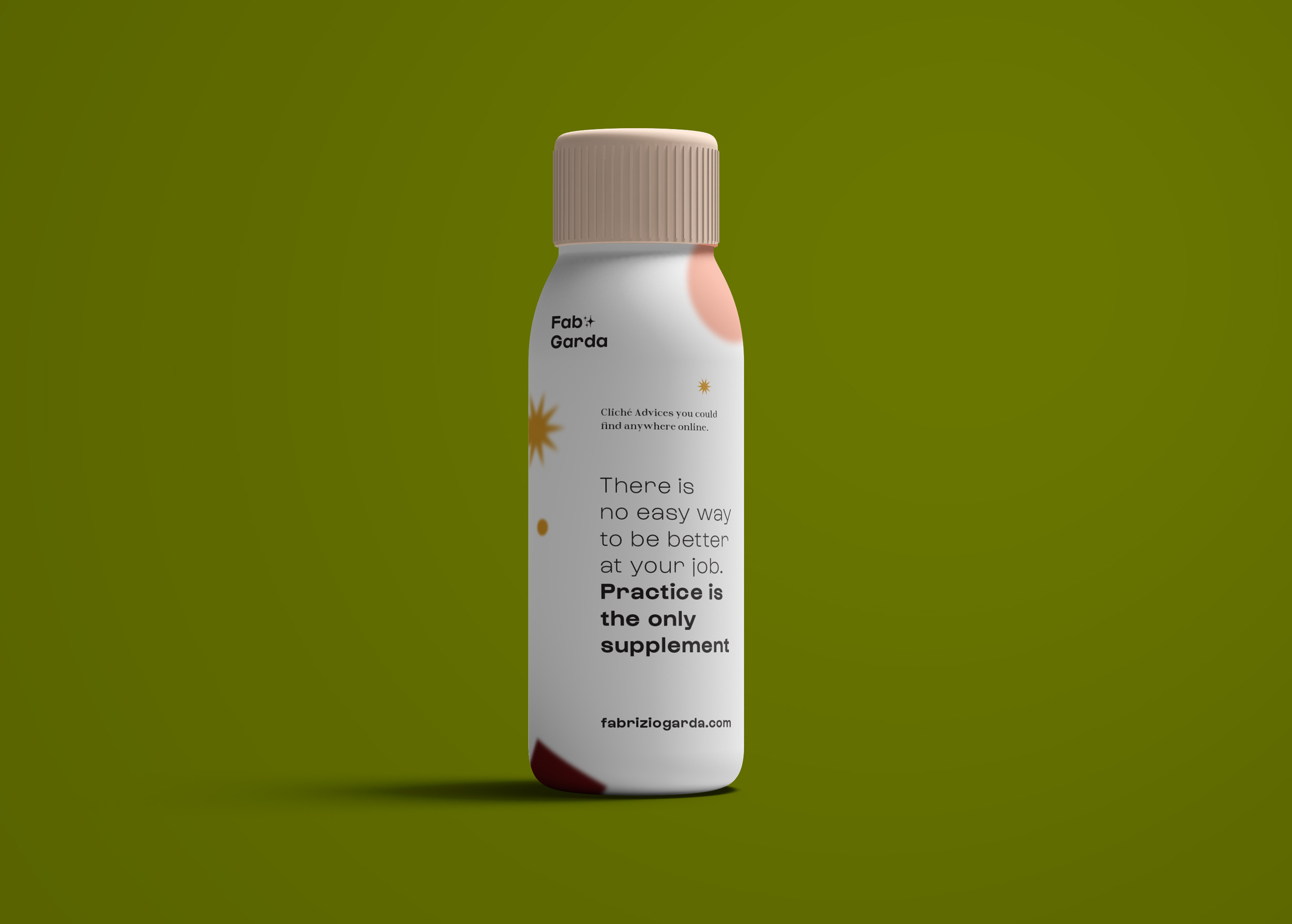
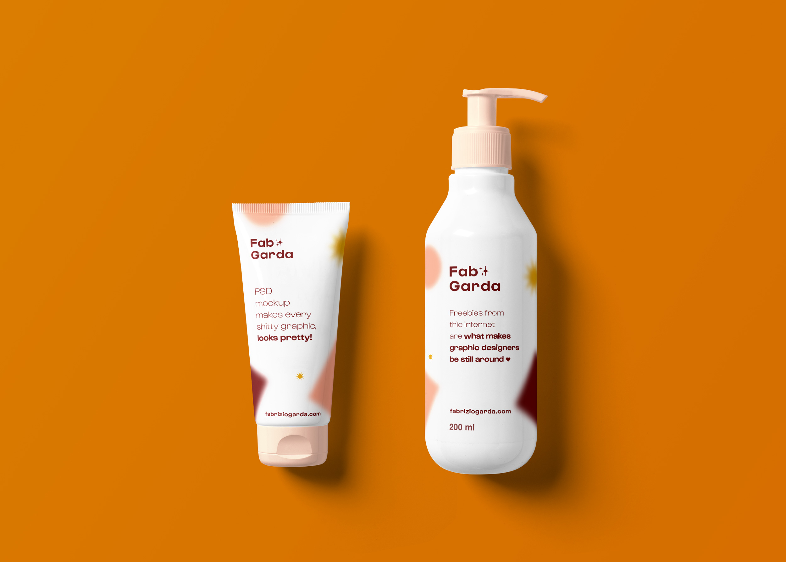
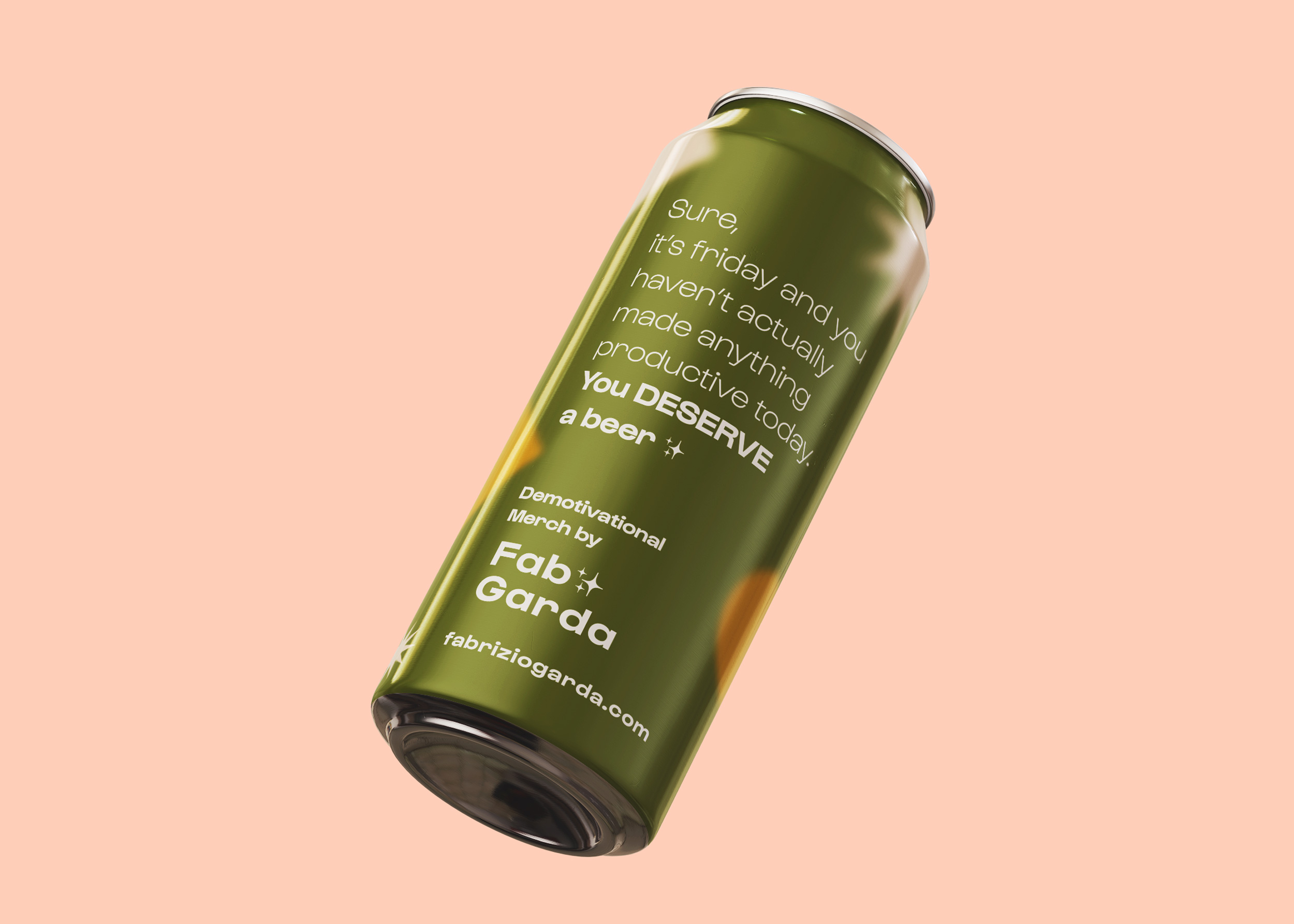
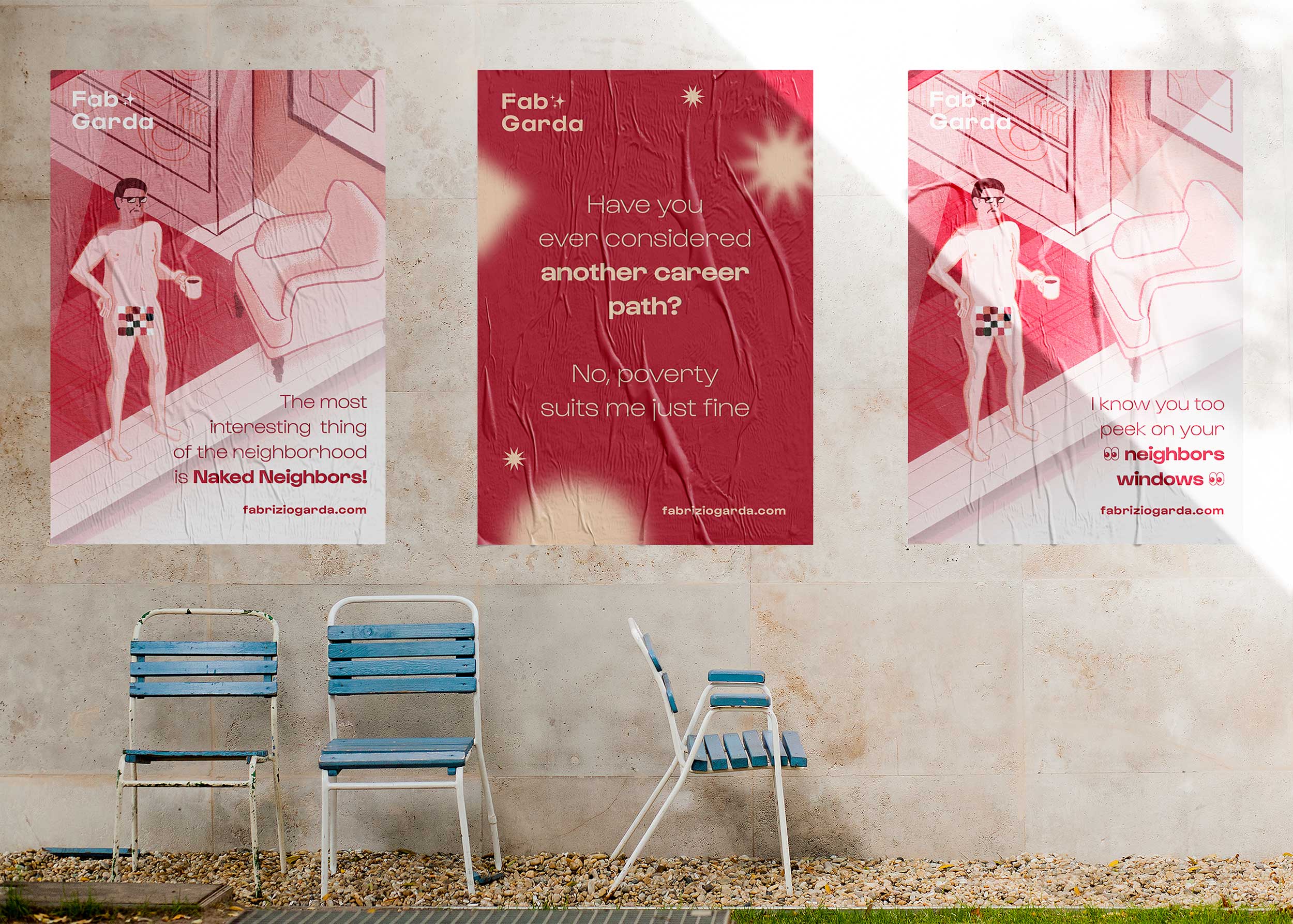
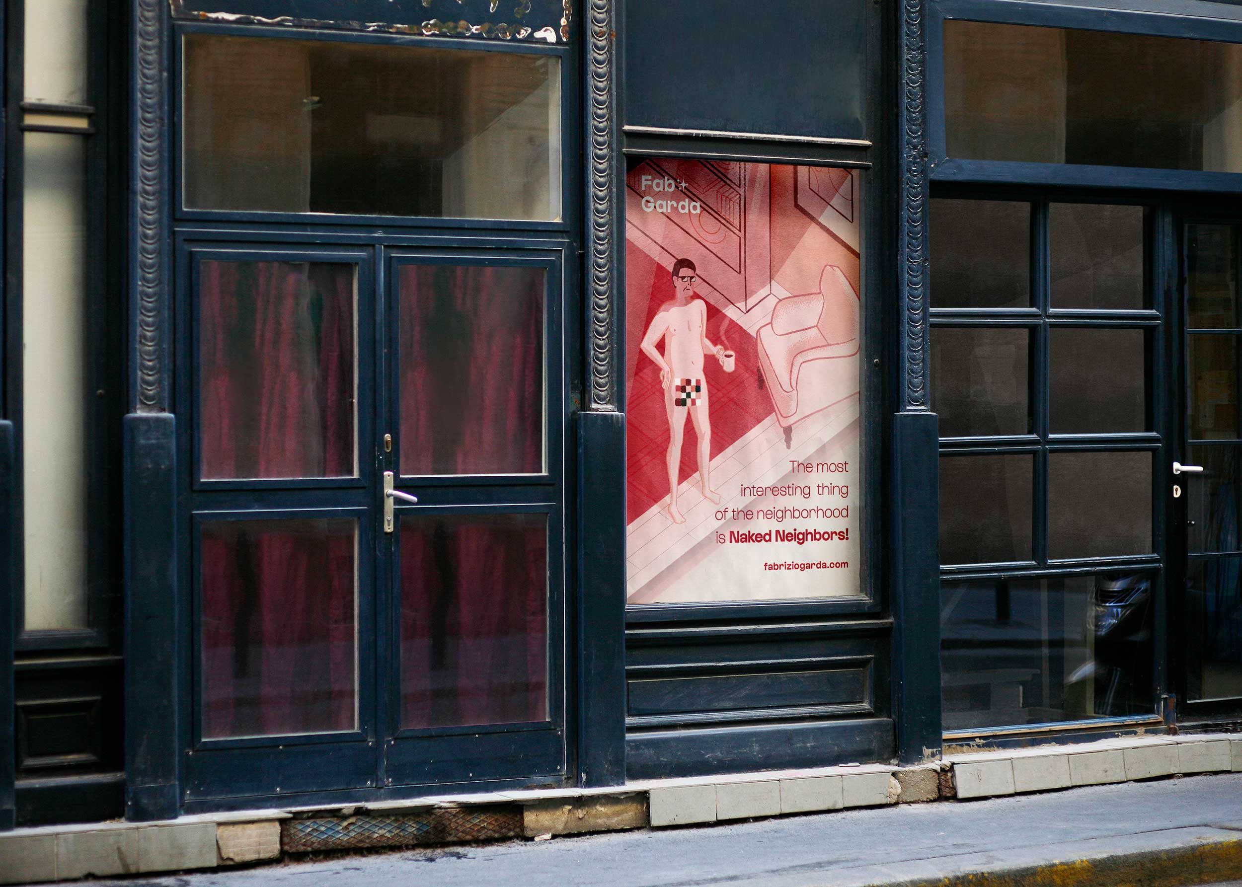
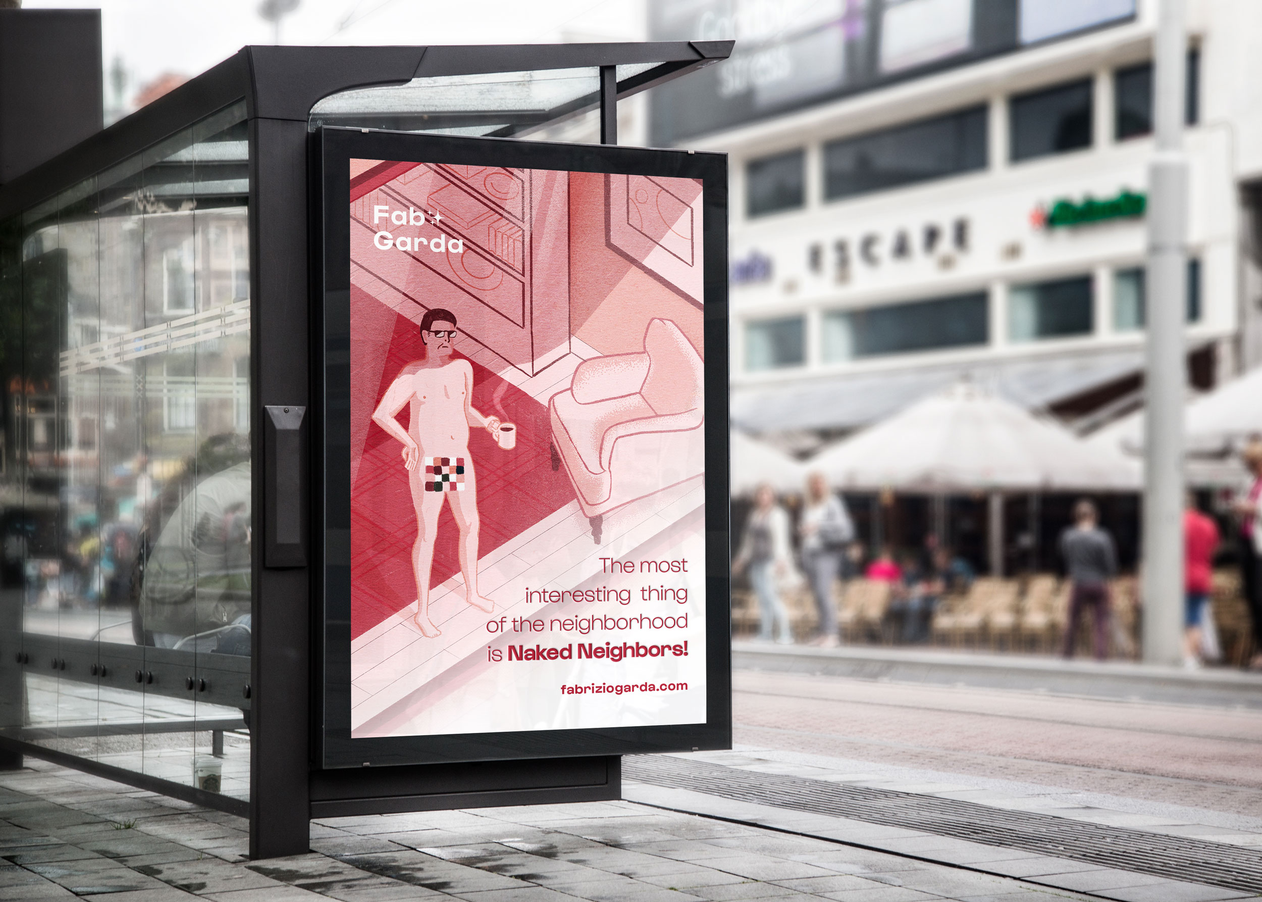
A “brand” would never be perceived as such without gadgets ✨️ so check below for few collaterals I made out of the amazing resources provided by the internet. Disclaimer: all of the amazing mockups you are going to see are from MockupWorld, my contribution comes only in the form of the sassy messages you’ll see on each merch piece.
