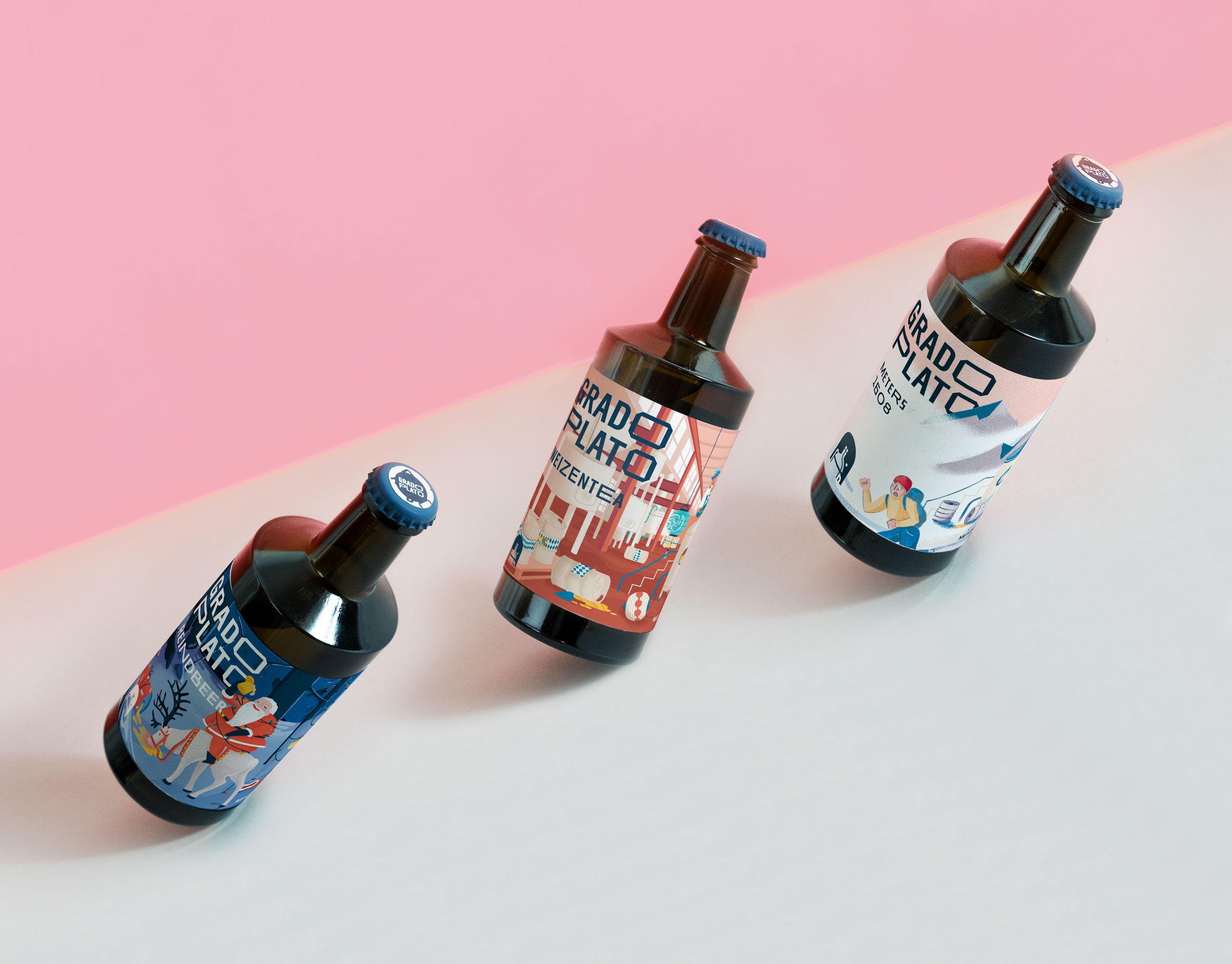
Grado Plato®
Brand Identity
& Label System
︎︎︎ Branding & Visual Design
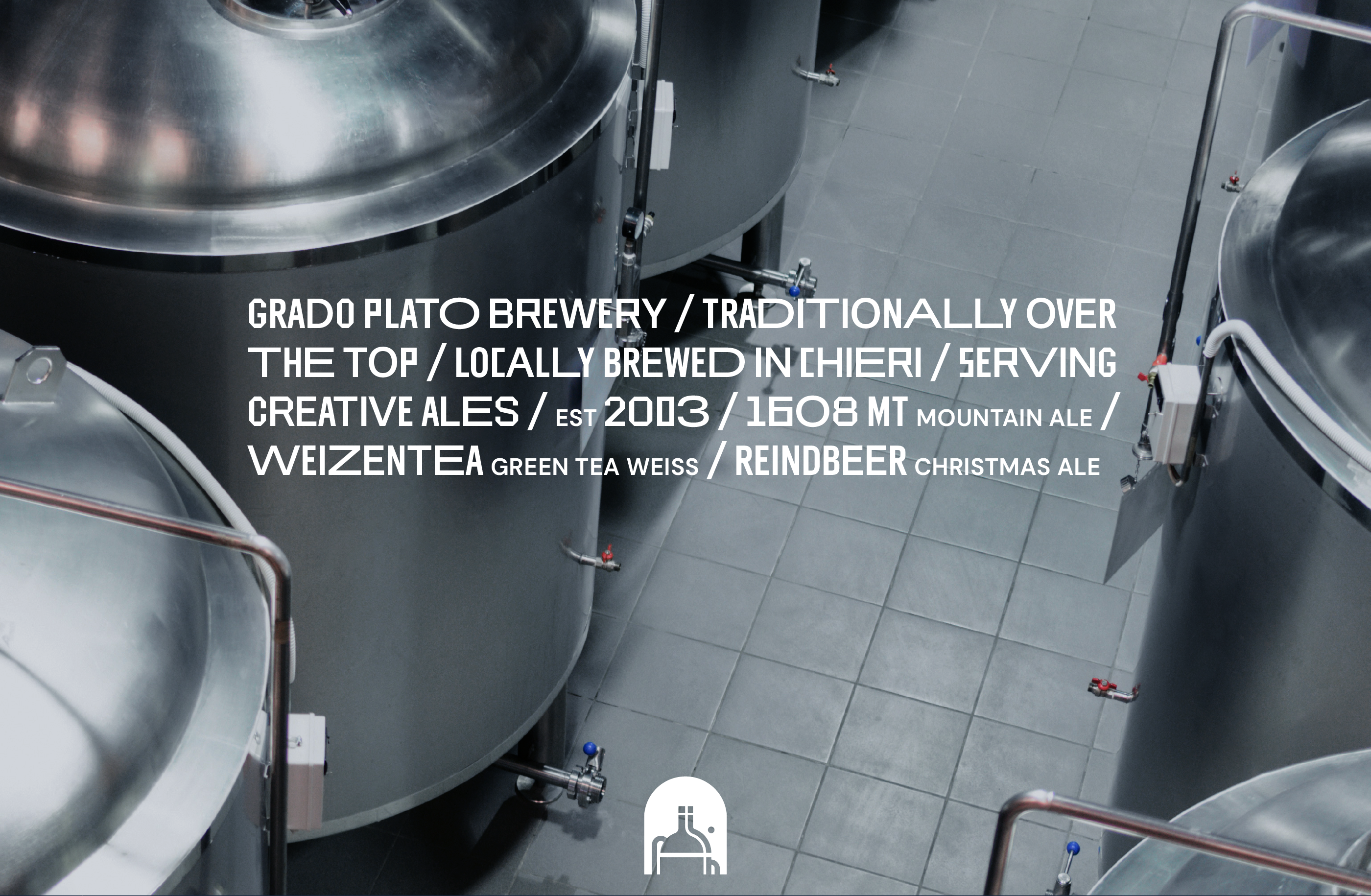
Since 2003 Grado Plato® has been crafting their solid, no frills beers out of their brewery in Chieri, Italy.
A place where respect for traditional processes mixes up with willingness to try new things, creating unexpected ingredient combinations. As the brand is growing and refining its image, we were asked to capture its true spirit through a punchy new brand with real shelf standout. Designed in partnership with Marta Monge︎ as part of the Super Superficial Design Collective.
Credits
︎Role - Visual Design & Illustration
︎In Collaboration with Marta Monge
︎Photography Enrica Maggiora
︎In Collaboration with Marta Monge
︎Photography Enrica Maggiora
︎Project Management Marco Signoretto
︎Typeface Stonewall50 by Feeld + Bobby Tannam
︎Typeface Stonewall50 by Feeld + Bobby Tannam
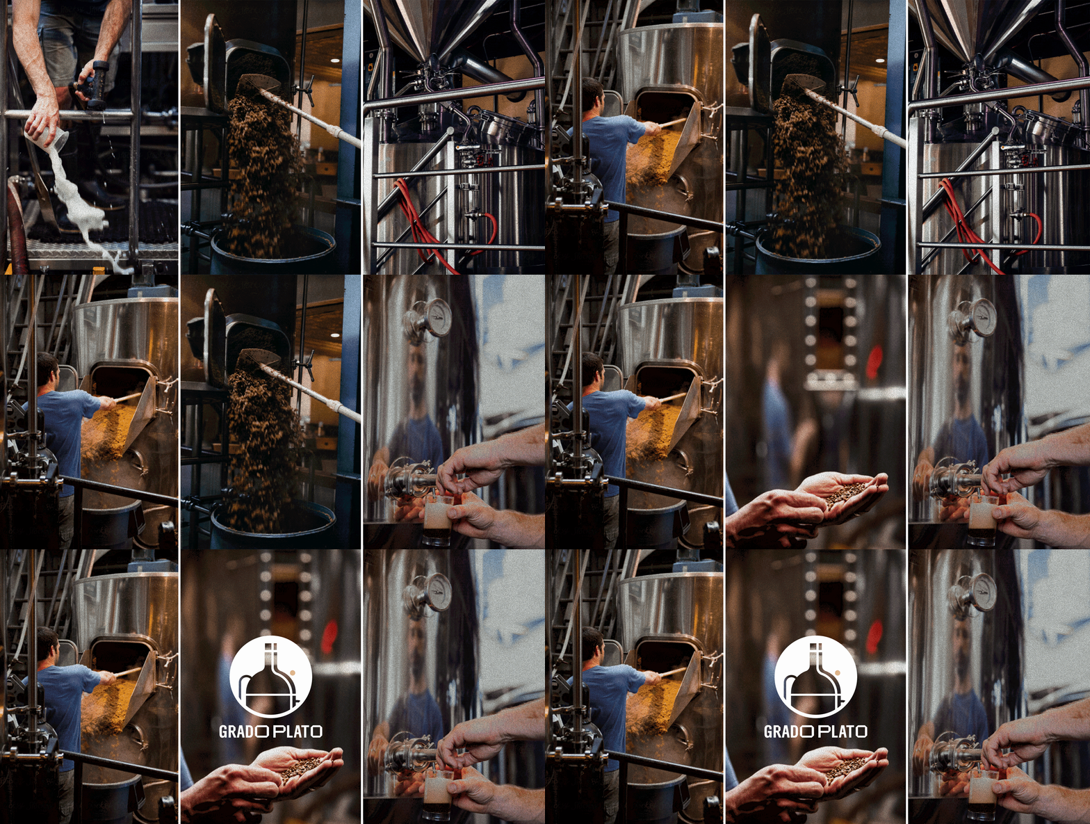
Logo Redesign
Further than updating and simplifying the original fermenter shape, we softened the harsh yellow / black palette juxtaposition by veering the latter towards a deep blue and introduced a bolder lettering, allowing the brand to stand out in its own typographic dignity. We used Stonewall 50︎ a brave multi-width display font that also happens to celebra
te the 50th anniversary of Pride and the 1969 Stonewall uprising. To keep up with a new, sharper look, we suggested a change in the design of the beer bottle too, opting for a more distinguished one capable of amplifying those 45° cuts connoting the "O"s in the logo.

Label Layout Concept
Label Layout Concept
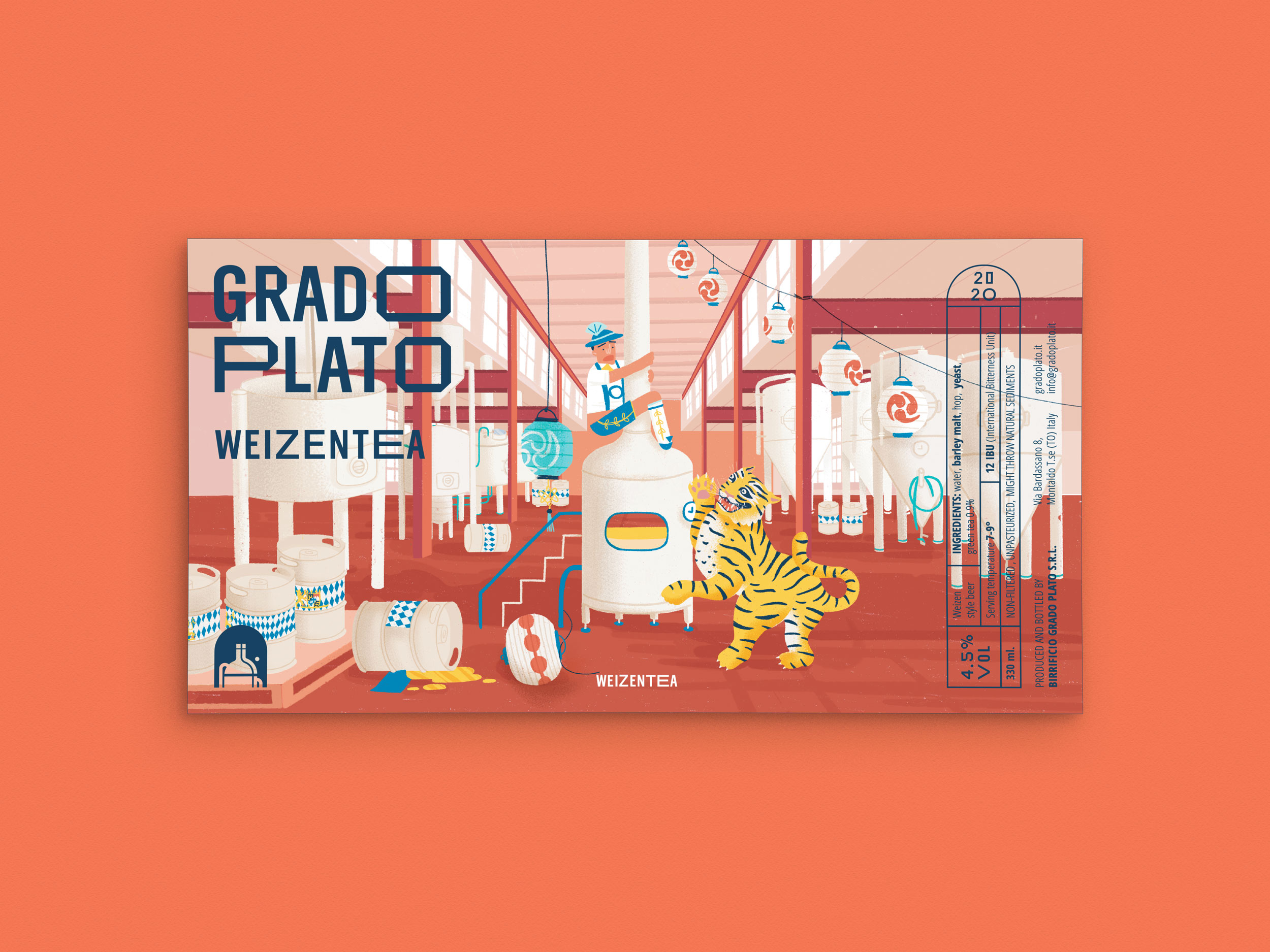
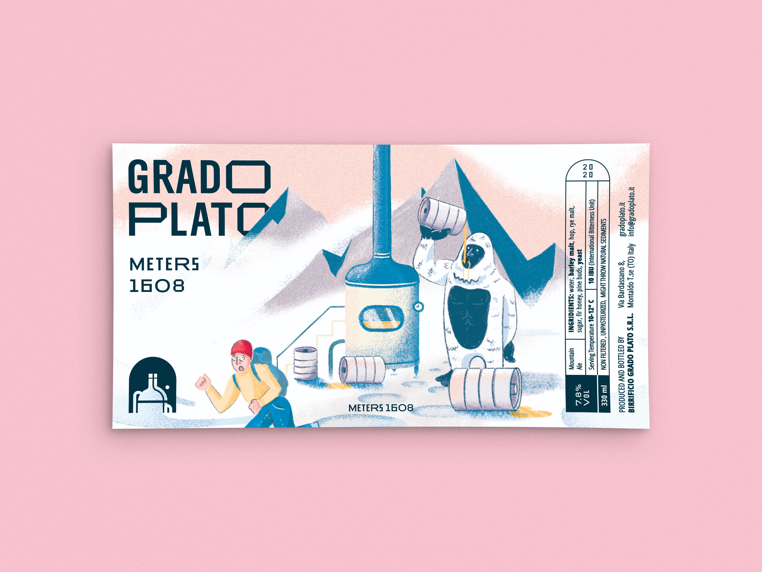
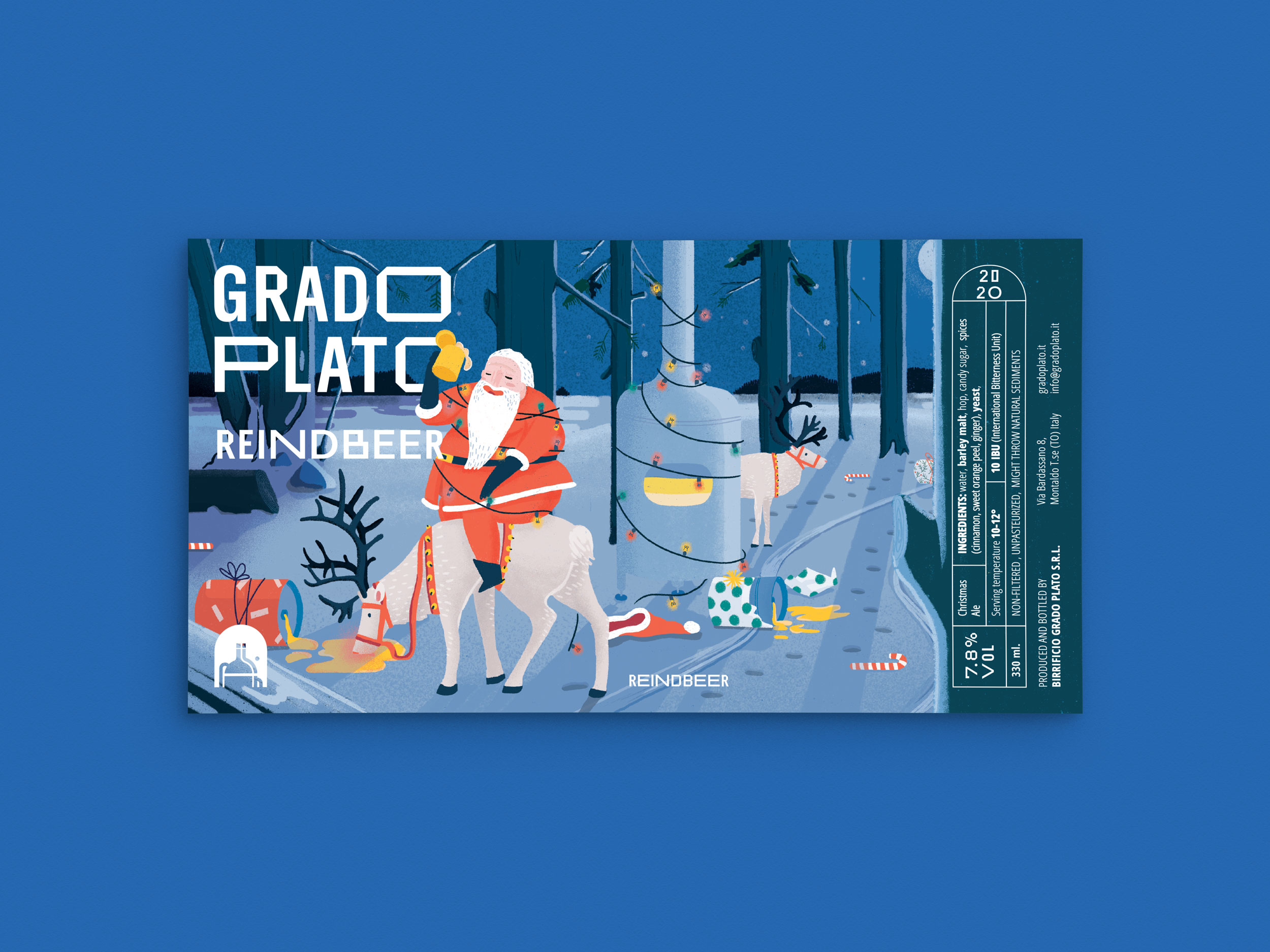
Each beer name hits a story, sometimes a personal one, shared by the founders and kept in some kind of secrecy, as the inside joke of a group of close friends. We liked the amount of history behind each bottle and wanted to celebrate that, without giving away those personal stories. That's why we chose to approach the project with fully coloured illustrations that give sense to those beer names – even though a fully twisted one.
Real life stories get blurred and mixed-up with hyperbolic, out-of-the-box scenarios –
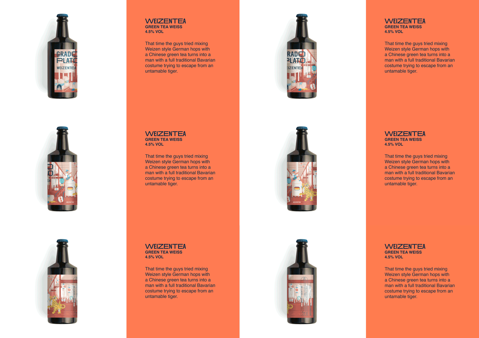
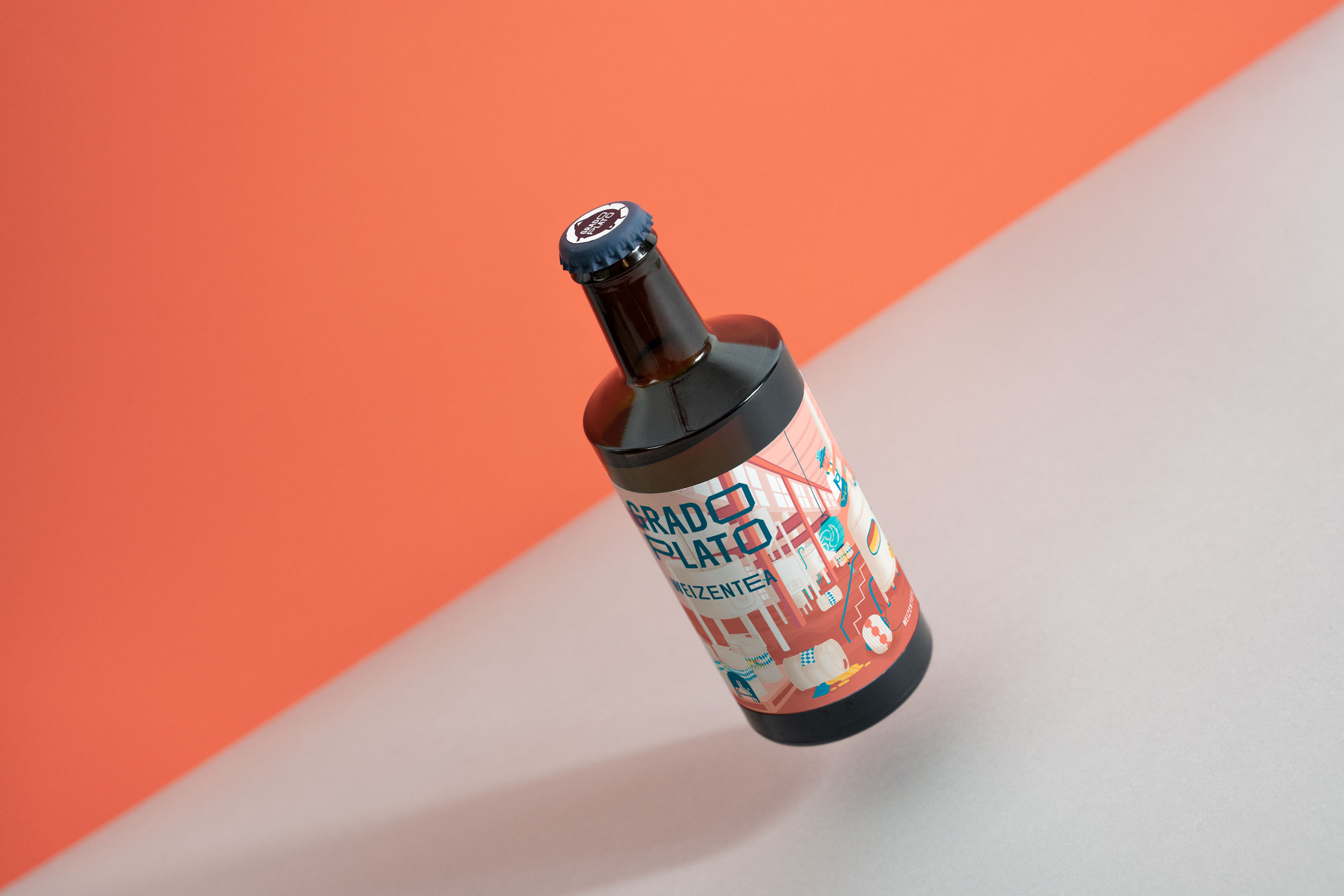
that story about when the guys tried mixing (a fancy kind of hop imported from Bavaria) Weizen style German hos with a Chinese green tea turns into a man in traditional Bavarian costume escaping from an untamable tiger.

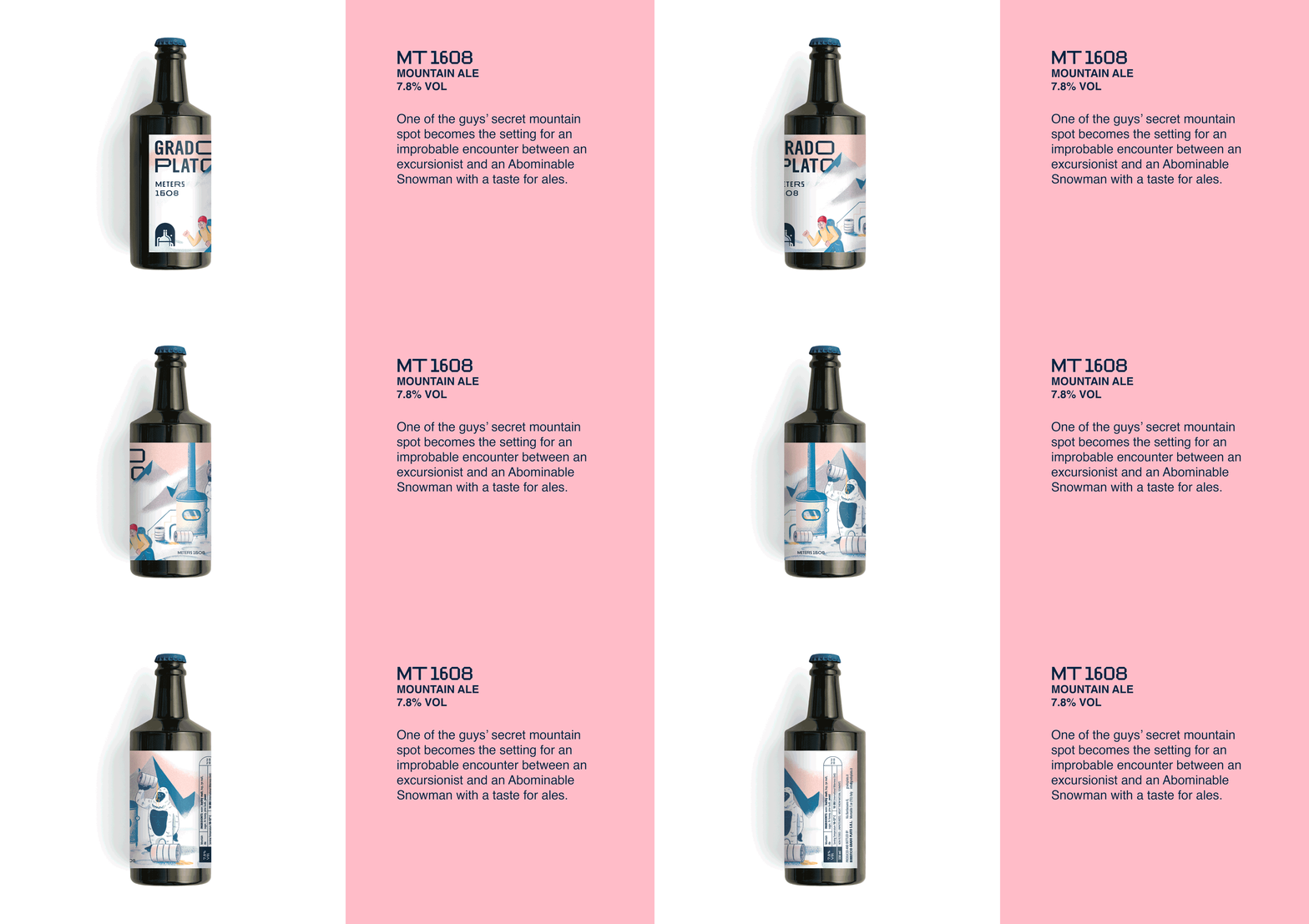
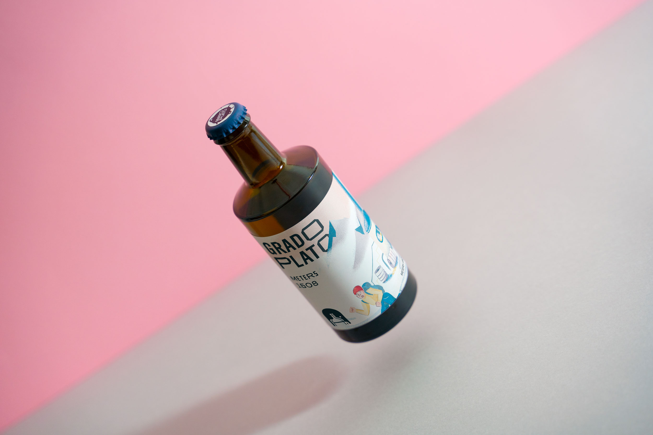
MT. 1608 Label
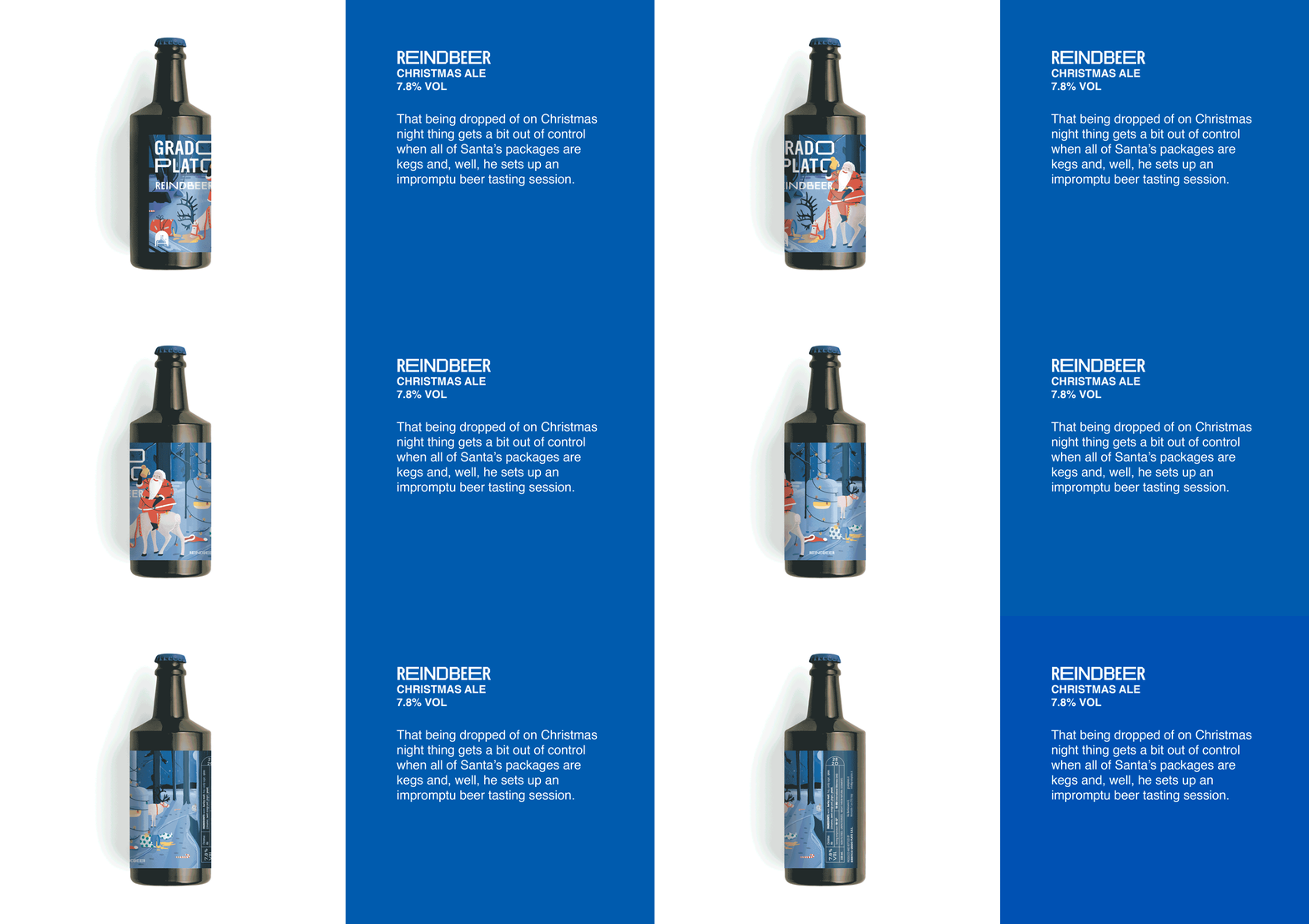
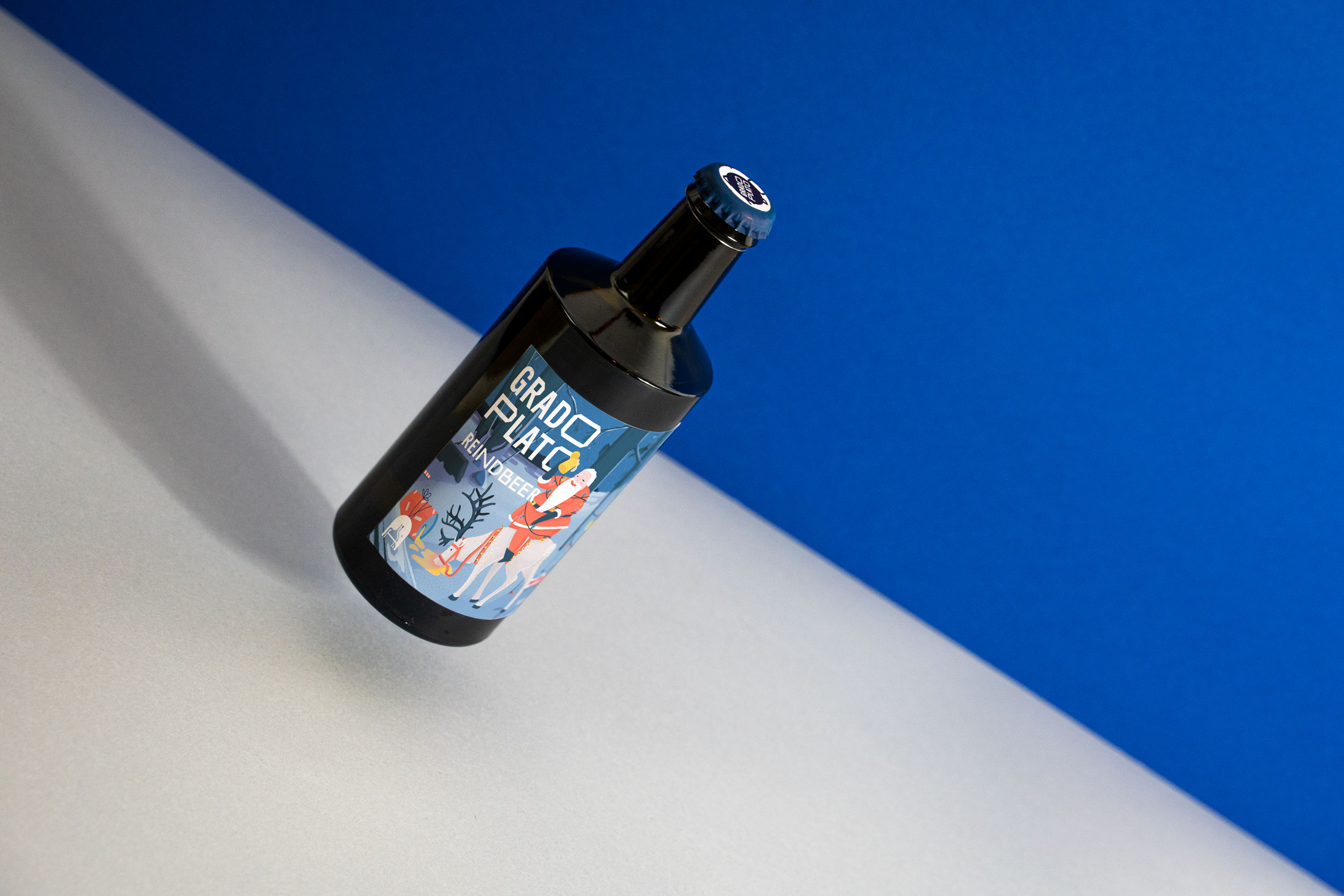
Reindbeer Label
Weizentea Label
