Expanding
the Arduino
Illustration System
︎︎︎ Brand and Creative Direction
In the tech industry, Arduino is recognized for its distinctive brand assets and visual communication style. The brand initially featured an illustration system depicting "living" electronic components, emphasizing the fun and engaging aspects of electronics. As the company expanded, so too did its branding needs and visual ecosystem. To enhance the illustration system, we introduced a new collection of characters, colors, and features, enabling us to craft new and captivating narratives.
Credits:
Credits:
︎ Role - Creative Direction
︎ Illustrations Research and Development - Ilaria Bocca
︎ Marketing support - Stefano Implicito, Massimo Banzi
︎ Illustrations Research and Development - Ilaria Bocca
︎ Marketing support - Stefano Implicito, Massimo Banzi

The value of community
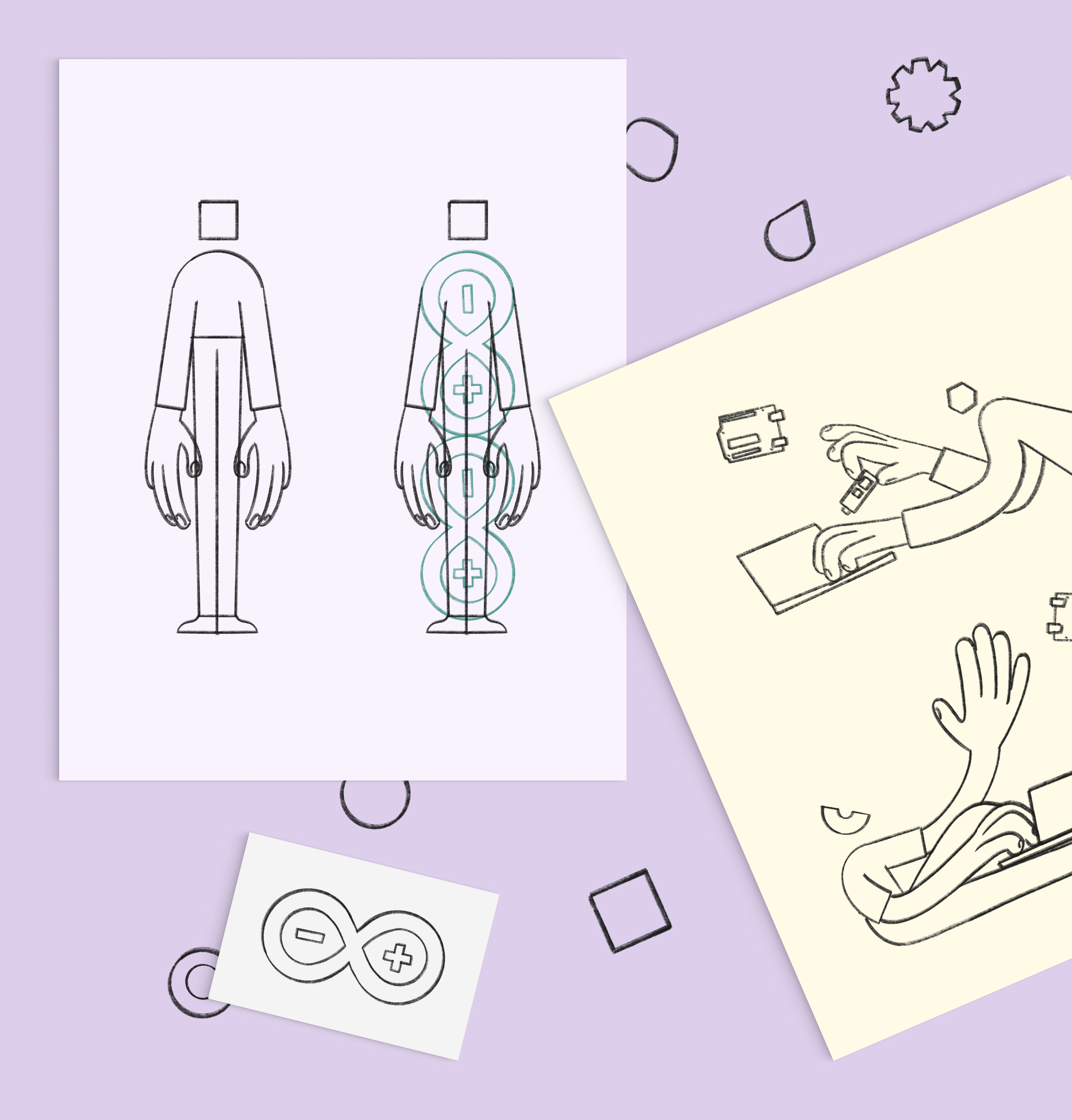
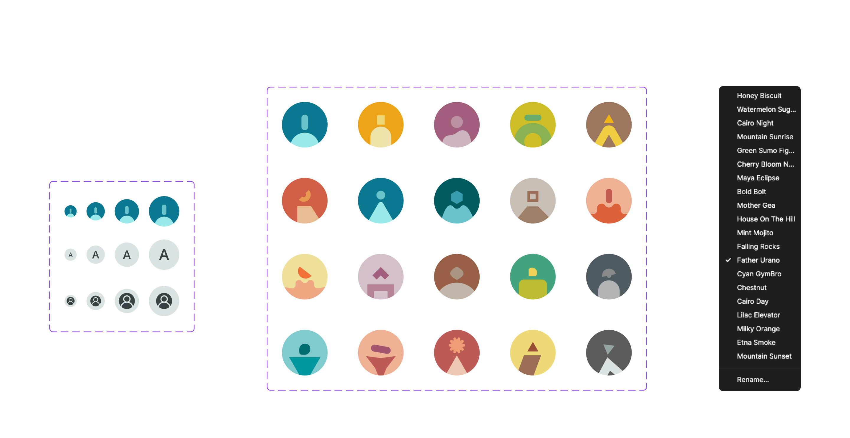
| The Arduino community is extensive and varied, encompassing a global network of 16.7 millions people who engage with our brand for work, leisure, hobbies, and other creative pursuits. To better reflect this diversity, we created a collection of characters designed to represent each person uniquely. With genderless and abstract features, this system ensures that everyone can see themselves represented. |
|
︎ Credits:
Check at the beginning of this project page for full credits.
Check at the beginning of this project page for full credits.
Expanding a system
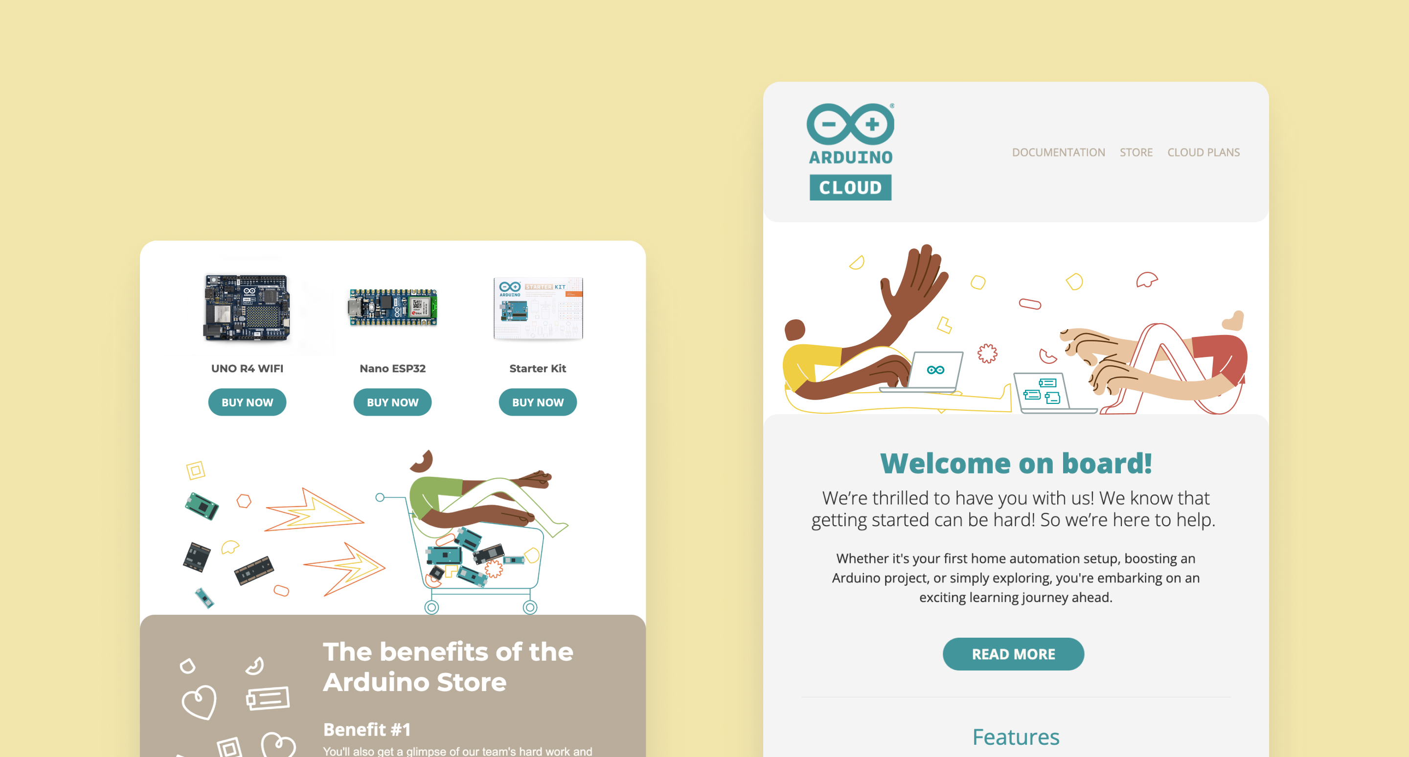
When outlining the brief for this project, we contemplated several factors. We considered how to expand our current illustration system instead of starting anew, how to accurately portray our characters, and the variety of stories each could embody. Although we wanted to preserve our living electronic components (affectionately referred to as puppets), we also aimed to emphasize larger systems, projects, and scenarios. To achieve this, we chose to "zoom out," transitioning from the puppets, through oversized hands, to fully depicted characters.

_
Arduino is dedicated to empowering individuals to innovate, providing them with a simple tool that can transform into anything they envision.
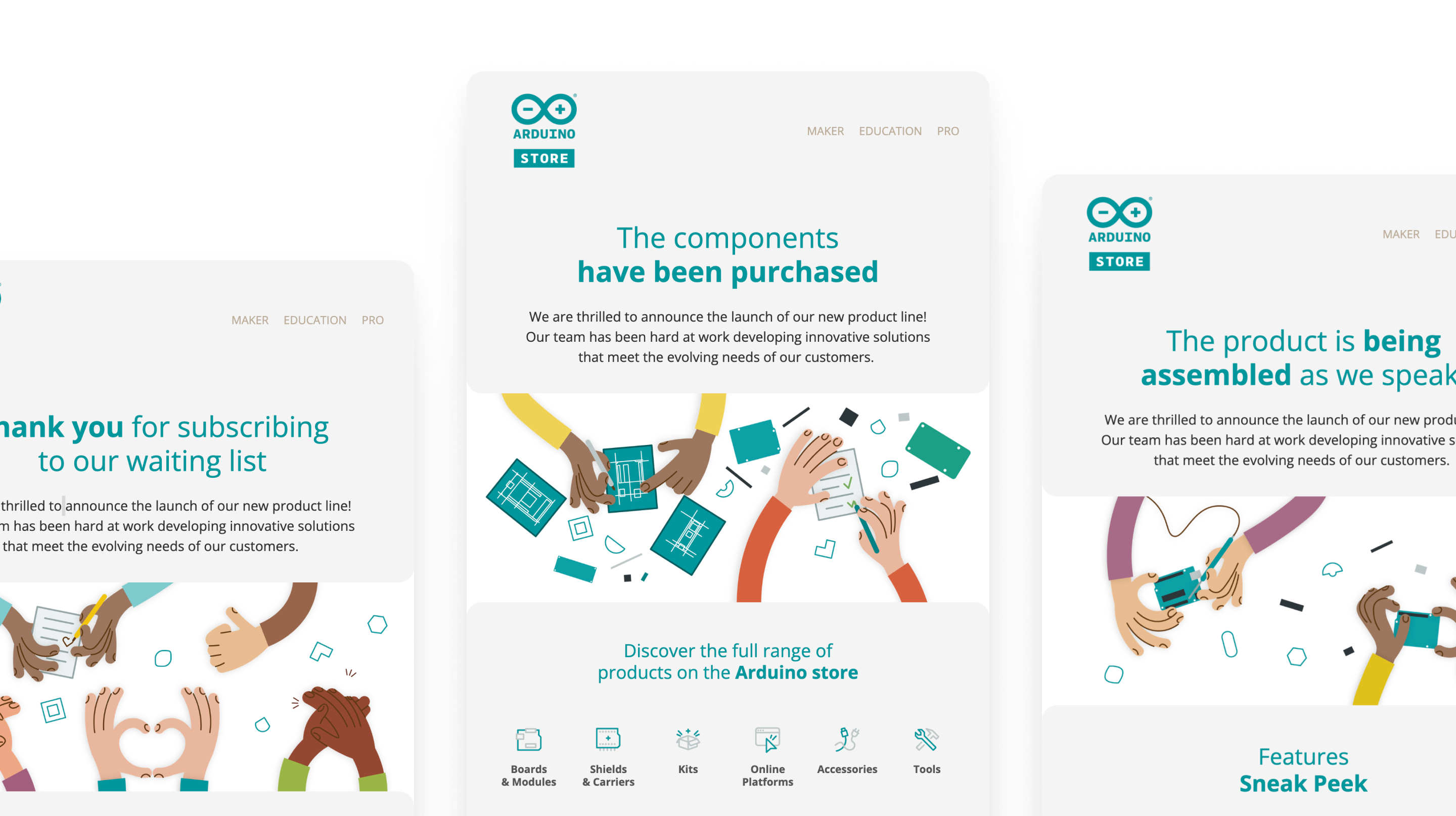
In this narrative, the emphasis is on hands and mind, the critical elements of creation. To illustrate this, we introduced a striking visual paradox: oversized hands that symbolize the ability to interact, build, create from scratch, and assemble—activities our community engages in daily with the help of Arduino.

Marketing Applications
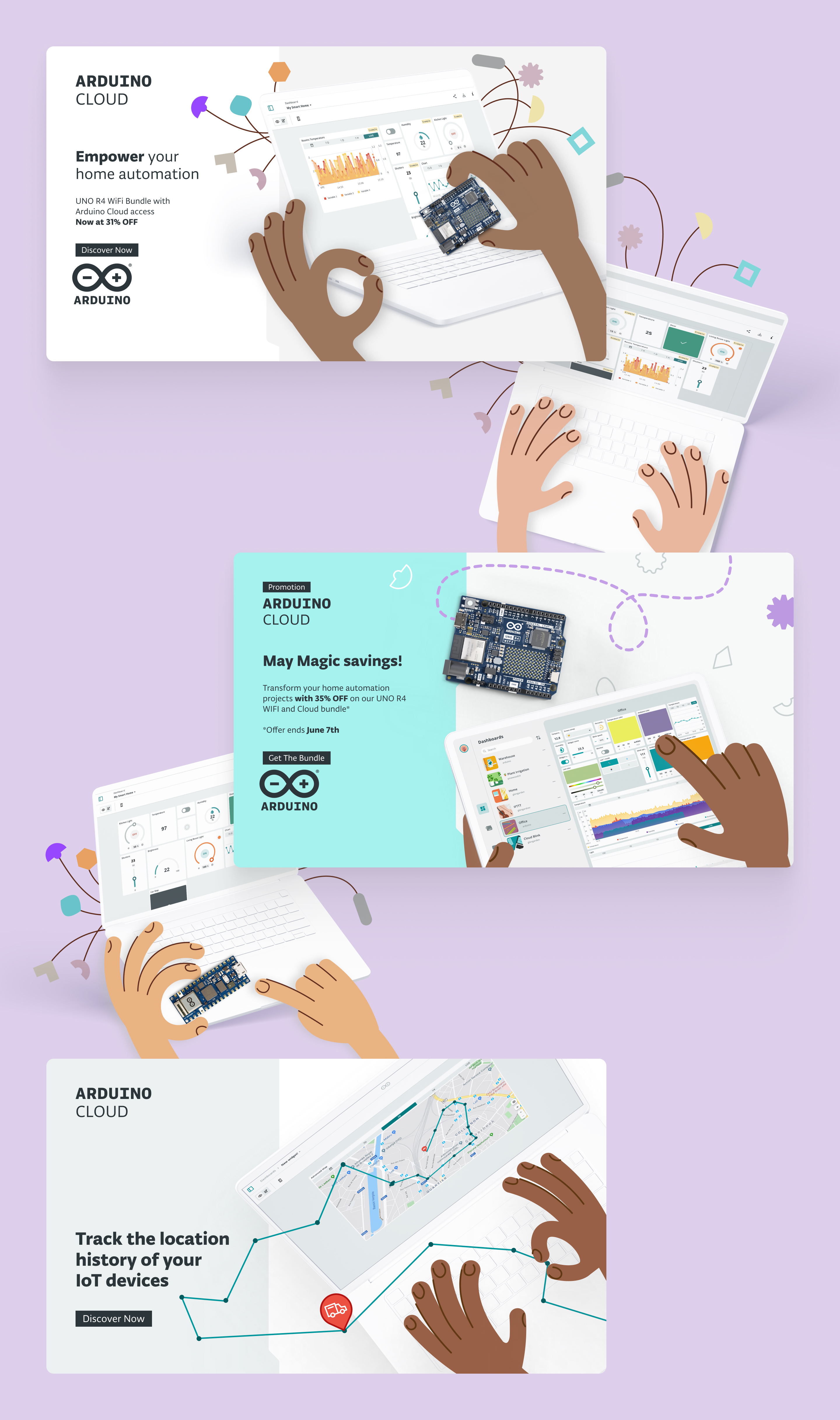
In our marketing campaigns, the hands play a crucial role in displaying our products.
They help in drawing attention to the products and making the whole visual asset more engaging.
They help in drawing attention to the products and making the whole visual asset more engaging.



Expanding the Pro Product Line
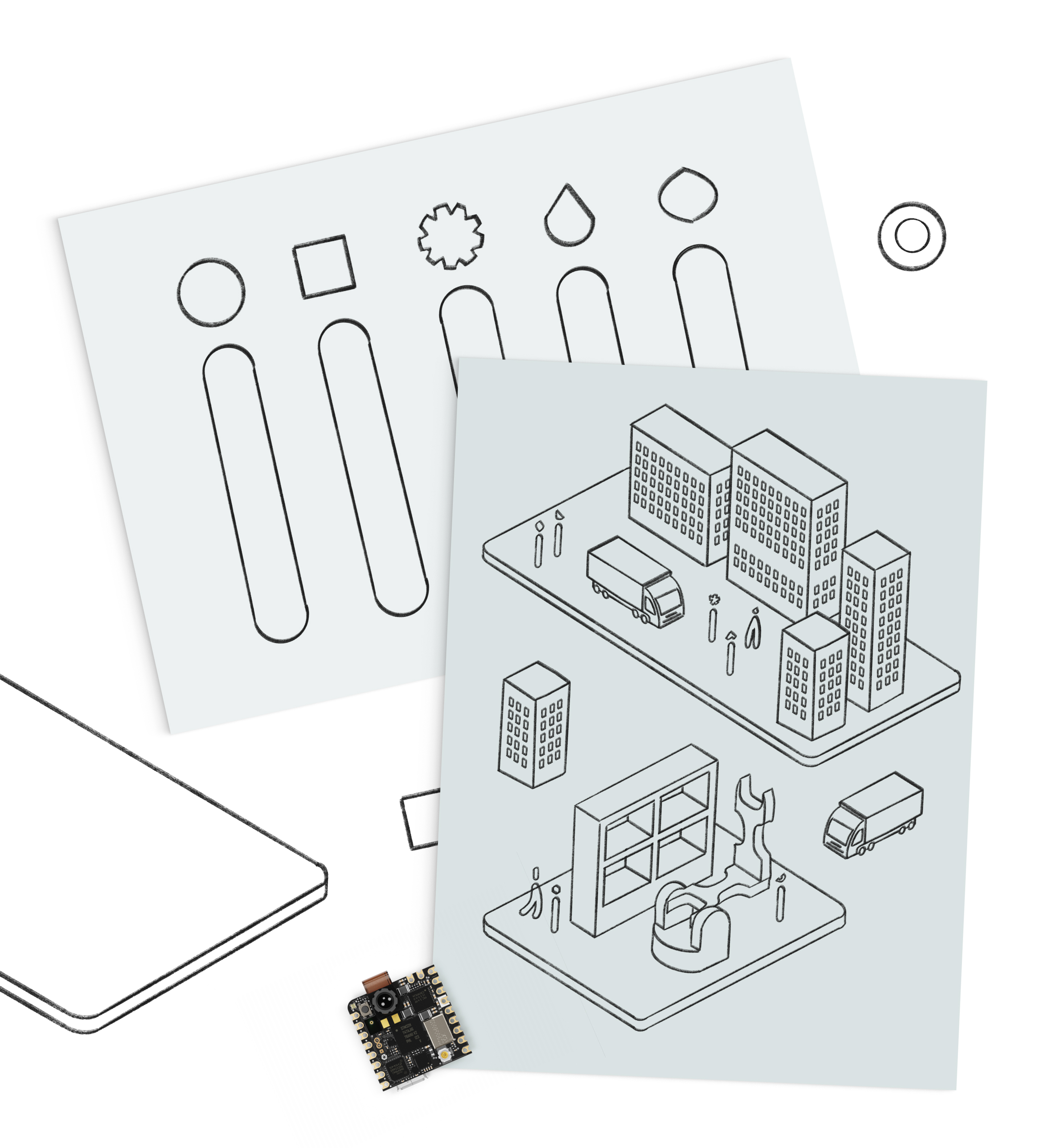
The challenge of further expanding this system to ensure that the Pro product line was fully represented led us to zoom out once again. Since Arduino Pro focuses on industrial applications and complex systems, we adjusted the scale accordingly. While makers, educators, and students concentrate on smaller boards and components, the Pro line involves intricate hardware interactions. We chose to depict this transition by presenting our boards as floating platforms, each hosting a critical element of these broader systems. This includes cargo, industrial facilities, and production lines, yet remains in harmony with the existing illustration system by preserving the unique abstract heads of the characters.
