
Arduino
Partner
Conference
︎︎︎ Event Visual Identity
The Arduino partner conference is an annual event designed to update Arduino partners on product developments, activities, and discussions regarding the evolution of the Arduino ecosystem. In 2023, with the assistance of Giulia Loi, we revamped the event's appearance and atmosphere to effectively convey its purpose.
The Partner conference is an annual gathering that convenes partners worldwide in an Italian setting, where Arduino staff presents their activities, initiatives, and upcoming projects to engage our partners. For this significant event, we were tasked with creating a distinctive look and feel to be integrated across collaterals, digital platforms, and merchandise.
Credits:
︎Role - Creative Direction
︎ Design production - Giulia Loi
︎Art Direction - Fabrizio Garda
︎Framer Website - Fabio Ferrero
︎Project Management and marketing support Silvia Galfo, Lucrezia Carnelos, Stefano Implicito, Massimo Banzi
︎ Design production - Giulia Loi
︎Art Direction - Fabrizio Garda
︎Framer Website - Fabio Ferrero
︎Project Management and marketing support Silvia Galfo, Lucrezia Carnelos, Stefano Implicito, Massimo Banzi
Key Features and Deliverables
| The Arduino brand hub materialized as an exclusive website accessible solely to partners and employees. It houses guidelines on logo usage, media packs for partners, color ratios, image and video guidelines, and more. Now open to all Arduino personnel, the hub serves as a singular source of authoritative information for the entire team. |
|
︎ Credits:
Check at the beginning of this project page for full credits.
Check at the beginning of this project page for full credits.
Results & Impact
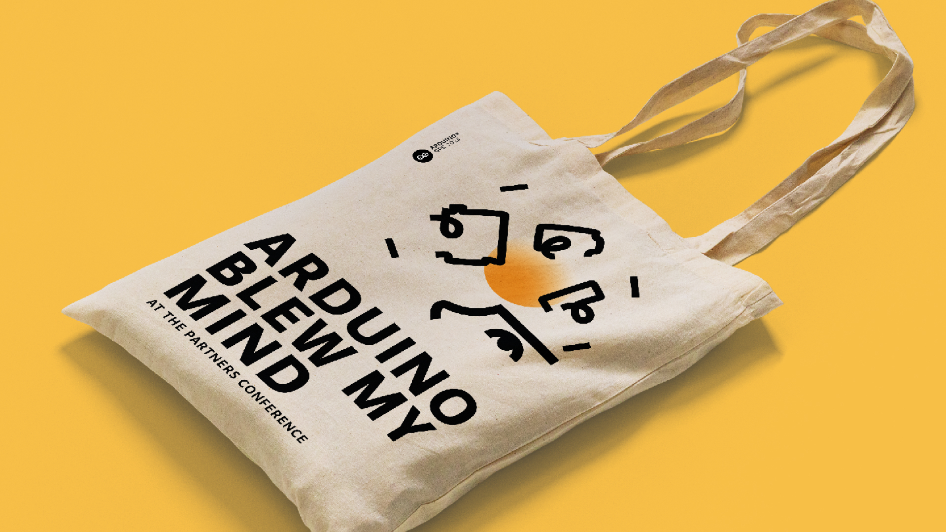
Partners who attended enthusiastically shared the results across social media channels. Presentation decks maintained consistency, and signage was strategically placed throughout the event venue. Attendees received welcome bags filled with accessories, sparking feedback and discussions about the event's fresh aesthetic.
Challenges & Solutions
| Giulia Loi spearheaded the creation of the illustrations and served as the primary driving force behind this project, while I focused on steering the overall creative direction. Collaborating closely, we dedicated time to determining the appropriate tone of voice for the event, drawing insights from previous editions, and aligning with our company's messaging goals. After exploring various sketches and rough mockups, Giulia proposed a visually impactful set of stroke-only illustrations, blending recognizable product shapes with abstract, mind-expanding concepts. Once we achieved visual consistency, Giulia Loi and Fabio Ferrero collaborated to develop the digital elements for the event's online page and social media assets. |
Conclusions
|
2025
2025©
All content by Fabrizio Garda.
Thanks for stopping by ︎
All content by Fabrizio Garda.
Thanks for stopping by ︎